Saturday, 18 December 2010

Email List Building for Bloggers

This isn't so much a review as a recommendation to read the series of blog posts about List Building for Bloggers (#LBB)  written by Phil Hollows, the Founder and CEO of FeedBlitz .  This is an alternative to Feedburner for pushing out RSS feeds to subscribers which I use.

This series of posts are designed to:
  • help you get the most benefit from your blogging 
  • harness the power and capabilities of email and social media communications network - together with your blog - to build a list of followers.
These are the posts to date on the Feedblitz blog:

Get the basics in place first
  1. Why aren't Email Lists Dead in the Age of Social Media?
  2. Lists, Email Marketing and Your Blog
  3. Five Key Steps to Grow Your Blog's Mailing List
  4. Growing Your List: Accelerating Subscriber Growth
  5. Growing Your List: Improving Engagement
  6. Avoiding the Spam Trap 
Optimisation of your Mailing List
  1. Mailing List Underperforming? Optimize it with these Tips!
I've been reading them as they've been published and, while I wouldn't necessarily follow all the advice, there's lots and lots of good content and reminders of things you know but forgotten.

Friday, 10 December 2010

Book Review: Color and Light by James Gurney

Color and Light by James Gurney
I've studied colour and light over the years and have many books on this topic.  However I've never ever come across a book which tackles this topic in such a comprehensive and authoritative way as James Gurney's new book Color and Light: A Guide for the Realist Painter.

Here's my review of this brilliant new book - which in my honest opinion is set to become a standard for all artists working in the realist tradition.

Title: Color and Light: A Guide for the Realist Painter  by James Gurney
Synopsis:  This is a comprehensive art instruction book about all the important aspects colour and light for students of art and those wishing to improve the quality of their painting in any media. It addresses the FAQs about these topics raised by painters and illustrators. 
Summary review: HIGHLY RECOMMENDED - This is a book for students and improvers and all those who want to know more about colour and how light and colour interact - in life and in a painting.  Practical application of the lessons learned is made possible through a very accessible text coupled with excellent use of images and graphics.  Coverage of this topic is comprehensive.
Highlights
  • comprehensive, informative and stimulating - about every aspect of colour and light relevant to the realist painter
  • James' style is very accessible - succinct and informative and avoids being unnecessarily technical
  • knowledgeable overview of the use of colour and light in different traditions and painting movements
  • he simplifies complex topics.  Enough information is given to enable the reader to grasp the point being made but not so much that it overwhelms the reader
  • useful review of the different types of colour wheel - excellent graphics
  • an excellent and systematic analysis of the properties of pigments (in an appendix)
  • interesting recommended reading list - not one you'll have seen before!
Think Again?
  • Not as technical as those who love the in-depth aspects of colour science might like - however all important aspects are covered in a very accessible fashion
Who should buy this?:
  • artists using every type of media
  • art students needing an excellent primer about colour in every aspect
  • particularly relevant to painters working in the realist tradition
  • those who don't like instruction books which are dumbed down or ignore important areas of knowledge
Who should not buy this?
  • People who like step by step books - because it's not one
  • People who like pointers on "how to mix colours" - because it doesn't do this
Author / (Publisher): James Gurney / Andrews McMeel Publishing LLC
Technical data: Publication Date: 30th November 2010
Paperback -  224 pages;

Let me be very clear on this point.   This book comes very highly recommended by me.  

I've not come across any other book which covers this topic in such breath and depth and makes it accessible as well. 
  • I've got ones which are more technical - but they're much less accessible. 
  • I've got ones which are as accessible - but they don't cover as much as he does
The major plus point about this book is that it is comprehensive and accessible art instruction of a very high order
  • It does not attempt to dumb down or omit important aspects of the way in which colour and light function and interact. 
  • It articulates very clearly how you can make choices about how to use different features of colour and light in a painting.
I am so confident about the impact of this book that I am happy to predict that if you buy and study this book your paintings will improve.

You can get an overview of what the book covers by reference to the Table of Contents.

There's so much one could say about this book - one could write a small book!  The table of contents gives you the headings - the summary below is what they actually mean in practice.  Here then are some of the more specific highlights of this book and reasons why it makes a good buy.

This book explains:
  • how outdoor studies of colour and light and plein air painting influence great studio paintings
  • how to look for sources of light in the paintings of others - in order to better understand their impact
  • how colours respond to different types of light - and why red looks good in a painting
Light and form
  • what are the different types of lighting and how it impacts on form
  • what's the best type of lighting for different subject matter
  • how light impacts on colour saturation and detail
  • five general truths about reflected light
  • what are the different types of shadows - and how they behave
  • how to simplify form in the context of the way light hits it
  • how a subject's material and ability to transmit light impacts on colour and light effects
  • how light and shade can add value (and drama!) to design of a composition
Elements of colour
  • the different types of colour wheel
  • the different types of colour
  • the characteristics associated with different types of colour
  • what a chroma value chart looks like
  • how greys and neutral colours can be your best friend
  • tips for handling greens (and reds and pinks!)
  • how tints and gradations are created
Paint and pigments
  • the different - and important - characteristics of pigments
  • how pigments can be charted
  • why painters start from underpaintings in an opaque colour
  • a simpler way of achieving an effective sky gradation
  • how you can create glazes
  • different ways of organising paint on a palette
  • different types of limited palettes
  • how to create mud
Colour relationships
  • the value of monochromatic colour schemes
  • the effect of colour temperature on the viewer
  • what are warm and cool colours and how to use them
  • the different ways of mixing colour
  • how a triadic colour scheme works
  • the value of the colour accent
Premixing
  • how to make a colour string
  • the value of premixing value steps
  • why it's important to leave out colours
  • what's the saturation cost
  • how to create a gamut mask
  • how a colour scheme can have a shape
  • how to create your source colours
  • what pushes you to identify accents
  • why a colour script is useful
Visual perception
  • how tonal and colour information gets processed
  • what can help create a more effective nocturne
  • how edges vary in different lighting conditions
  • why Goethe was wrong
  • how to isolate a spot of colour
  • schemes which describe how colours influence one another
  • colour associations and their impact on our psychology
  • how transmitted light works and what its impact is
  • what subsurface scattering is and how it works
  • the different colour zones if the face
  • how to create convincing hair
  • what a caustic reflection is and how it is generated
  • three rules of specularity
  • the different types of highlights - and how they work
  • how to use photographs more effectively
Atmospheric effects
  • how the color gradations work in a sky
  • the impact of atmospheric perspective on colour
  • what is reverse atmospheric perspective - and how it works
  • why painters prefer to work at dawn and dusk
  • how to paint sunsets from observation
  • techniques for painting rainbows
  • why transparency is important when painting trees
  • how sunbeams and shadowbeams work - and when to use them
  • the shape of dappled light
  • three rules of cloud shadows
  • how the lighting and colour of the foreground influences design and focus
  • why the age of snow makes a difference
  • reflections, refraction and shadows on water - and why they are different
  • how the behaviour of water impacts on colour and light
Now I'd extremely surprised if a lot of this is not entirely unknown to self-taught painters.  Much much may also only be a vague memory to those with fine art degrees - assuming they were ever taught it in the first place!

I first commented on Color and Light in MAKING A MARK: "Color and Light" and Making a Mark.

.......and finally

James Gurney's first art instruction book was published in 2009.  A year ago I published my review of it - see Book Review - Imaginative Realism by James Gurney

Note:  I was sent a review copy of "Color and Light" by James Gurney. 

Sunday, 21 November 2010

Online publishing platforms - the numbers compared

This post focuses on the relative traffic, size and impact and reach of the different online publishing sites.   This is because many artists now like to be able to publish their artwork or sketches in books and some also publish art instruction online. 

Online publishing platforms

I'm focusing on three publishing platforms.  Their own descriptions of themselves are quoted below.
Make your own book with Blurb online. Create photo books, wedding books and more. Design and publish professional quality books to keep, give or sell
Lulu.com brings the world of online book publishing to you. Looking to self-publish? Lulu's print on demand (POD) solutions make it quick and easy. Create a book in minutes, publish with the click of a mouse, distribute, sell and print books to order. It's that simple.
Explore a world of publications by people and publishers alike. Collect, share and publish in a format designed to make your documents look their very best.
Below you can see what the unique monthly visitors are for the different sites when their website URLs are plugged into compete.com - a site which provides comparative site profiles.


Comparison of the USA traffic for three online publishing sites: issuu, lulu and blurb
Compete's data comes from a statistically representative cross-section of 2 million consumers across the United States who have given permission to have their internet clickstream behaviors and opt-in survey responses analyzed anonymously as a new source of marketing research.  compete.com
These stats came as a bit of a surprise to me.
  1. I'm surprised that Lulu is about twice as big as blurb.  I knew it was bigger but not that much bigger
  2. I'm amazed at how just how big Issuu is and will be seriously looking into this as a vehicle for publishing my work in future.  Capturing the corporate audience with repeat readers is obviously an excellent way to grow your business.  It remains to be seen whether it does the same for independent publishers.
Bear in mind that
  • the above are predominantly statistics for an American Audience. 
  • You only really begin to get an appreciation of the global audience for Issuu in the Quantcast pages (see below) - and that's because it's so big.  
  • The US audience for Issuu is only around 25% of its global audience.
This is what each of the sites look like on Quantcast which is one of my favourite analysis sites in terms of a demographic analysis of visitors by sex, age group, earnings and college education status.  It appears to indicate that each of the publishing sites appears to attract the same sort of audience for their services.

Click the link in the title to see the full Quantcast page.

Blurb on Quantcast - ranks 7,096 in USA


Lulu on Quantcast - ranks 2,740 in USA


Issuu on Quantcast - ranks 158 in USA


In conclusion:
  • Issuu is HUGE compared to the other two platforms - but only delivers online publications
  • If you want to have your book or publication about your artwork found online by readers independently of your website or blog then you need to look very seriously at issuu
  • If you want to produce a physical copy of your book for distribution to clients or galleries then you're better off looking at Blurb or Lulu.
This is a very much a first look at these three sites in comparison to one another.  I'll be revisiting them. 

What do you think?

In the meantime if you've got experience of any of the three sites and would like to share your experinces please leave a comment below.

Friday, 12 November 2010

New colours from new pigments

Winsow and Newton have published an article about the new pigments which they have introduced in recent years in Why are new pigments so important?.  This succinctly describes the origins, pigments used for and performance of the new colours.
By the 1990s there were so many new organic pigments available that Winsor and Newton embarked on some far reaching reviews to ensure artists would be able to enjoy everything from entirely new colours to greater brilliance and permanence. Almost 200 new colours were introduced over the following 15 years and this process is still continuing today.

1996 Winsor and Newton embarked on the most significant change to the Artists' Water Colour range in 164 years. The availability of so many new pigments meant that 35 new colours were introduced into the range, offering artists the widest and most balanced spectrum with the greatest permanence.
They key issue has always been about how to balance transparency with lightfastness.  Older pigments frequently had one but not the other and the challenge has been to develop new pigments which provide quality performance across the spectrum and over time.

Winsor & Newton Watercolour Chart 2010 - see Catalogue 2010

The new colours covered in the article (click the link at the top to read it) are listed below.  The new pigments which are most prominent in the ones listed below are the quinacridones and the perylenes.  I was pleased to note that there is now a permanent carmine based on Quinacridone pyrrolidone.  Apparently it's still so new that it does not have a colour index number as yet!

The acronyms after their names are for Artists watercolours (AWC) Artists Oil Colours (AOC) and artists Acrylic Colours (AAC)

Yellows: 
  • PY184 -  Bismuth Yellow (AWC*, AOC*, AAC*)
  • PY150 -  Transparent Yellow (AWC), Indian Yellow Deep (AOC), Nickel Azo Yellow (AAC)  
Orange:
  • P073 -  Winsor Orange (Red Shade) (AWC), Winsor Orange (AOC), Pyrrole Orange (AAC)
Reds:
  • PR255 -  Scarlet Lake (AOC), Pyrrole Red Light (AAC)
  • PR254 -  Winsor Red (AWC), Bright Red (AOC), Pyrrole Red (AAC)
  • PR264 -  Winsor Red Deep (AWC)
  • PR209 -  Quinacridone Red (AWC, AOC, AAC)
  • Quinacridone pyrrolidone - Permanent Carmine (AWC, AOC)
  • PR206 -  Brown Madder (AWC), Quinacridone Burnt Orange (AAC)
  • PR233 -  Potter’s Pink (AWC, AAC)
  • PR149 -  Winsor Red Deep (AOC), Perylene Red (AAC)
  • PR179 -  Perylene Maroon (AWC, AAC)
Violets:
  • PV29 -  Perylene Violet (AWC, AAC)
  • PV15 -  Ultramarine Violet (AWC, AOC, AAC)
  • PB74 -  Cobalt Blue Deep (AWC, AOC, AAC)
  • PB60 -  Indanthrene Blue (AWC, AOC, AAC)
Greens:
  • PG50 -  Cobalt Turquoise Light (AWC, AOC, AAC)
  • PY129 -  Green Gold (AWC, AOC, AAC)
Earths:
  • Mixture due to replacement -  Quinacridone Gold (AWC, AAC)
  • PBr7 -  Brown Ochre (AWC, AOC)
  • PR101 -  Caput Mortuum Violet (AWC), Mars Violet (AOC), Violet Iron Oxide(AAC)
Black:
  • PBk31 -  Perylene Green (AWC, AAC), Perylene Black (AOC) - the first new permanent black for thousands of years!
Below are links to the various colour charts for artists colours which can be seen online

    Thursday, 11 November 2010

    More about Lightfastness

    As manufacturers begin to appreciate that lightfastness does matter to artists, we're beginning to see more and more information published by those that make the art materials we buy

    I just want to highlight today a couple of examples:
    • the new Love Pencils - the Derwent blog created by the Cumberland Pencil Company has a post Lightfastness Testing Revealed!  about how they test for lightfastness
    • Schminke - who make pastels I use - have a two page leaflet about the processes they use when creating art materials (see lightfastness.pdf available to download as a pdf file).  In it you can see an example of the blue wool cards used as a quality control by many companies manufacturing art materials.  This gives you a very good display of just how much fading happens in those actually graded 'lighfast' at levels 5 and 6 - and just how much disappears at the lower end of the scale.  
    Seeing real blue wool cards like this - and how dramatic the fading can be - is what woke me up to the cause of lightfastness.  I now aim to use only pencils which meet levels 7 and 8 (ie 4 star and 5 star pastels and pencils).

    Extract from Schminke Leaflet - Lightfastness – A Measure of the Durability of Artists’ Colours (pdf file)
    I also learned something new from the Schminke leaflet and that is lightfastness levels MUST always tested on the finished product as the mediums which combine with some pigments can result in colours which darken.

    You can read and learn more about lightfastness on two of my resources for artists sites:

      Friday, 5 November 2010

      Which is the most helpful art business book?

      Over on my "resources for artists information site - The Best Art Business Books - I'm running an opinion poll to try and get different artists' perspectives on which art business-related book you find the most helpful. 

      Not that there can be any one book which suits all artists - because everybody has their own individual needs and preferences.  However, it is interesting to know which are the ones which people have found more helpful.

      One of the reasons for doing the poll was to also highlight these books which I've found are so very often get buried in art bookshops and on Amazon. 

      However it's not had a lot of responses to date - so I thought I'd highlight it here too.  So here's the LINK to the opinion poll - Which is the most helpful art business book?

      Which art business book have you found most helpful?

      The books listed (alphabetically) in the poll are:
      Do please comment below if there is a book you'd like to particularly recommend.

      Links:

      Saturday, 30 October 2010

      How to create a Lazy Susan Coloured Pencil Holder

      Lesley Crawford's Lazy Susan Coloured Pencil Holder
      courtesy of David Crawford, Janie Gildown and Barbara Newton
      all photos copyright Lesley Crawford
      This post describes yet another way coloured pencil artist Lesley Crawford has found to store her art materials.  Earlier this month this blog has a post about Storage for Unison pastels.  This post is about how to create a "Lazy Susan" pencil holder for coloured pencils.

      How many times do we see great ideas for helping us sort out our studio in books?  But do we all put them into practice?

      Like many coloured pencil artists, Lesley likes to have all her art materials and storage sorted while working in her studio.  She used to have problems with tins and boxes of coloured pencils all over her desk.  They took up too much space.  Plus she also didn't like the way she had to shuffle through pencils bunched together in jars, especially when the shorties fell to the bottom!

      Then she saw the Lazy Susan Pencil Holder - as pictured in the Colored Pencil Solution Book by Janie Gildow and Barbara Benedetti Newton.  She asked her husband David if he could work out how to make the pencil holder from the picture!

      This is her explanation of how it came about once David had studied the picture and worked out how to make it.  Thanks to Lesley and David for both the story and the pictures - and thanks to both Janie and Barbara for the inspiration!

      Instructions for Making a Lazy Susan Pencil Holder
      Here's the instructions for making a pencil holder.  It's very simple to make.

      The starting Point - a wooden Lazy Susan

      Materials:
      • Lazy Susan (a circle of wood on a small circle of wood joined by ballbearings so that it spins round - available from kitchen shops).  The one we bought is 14 inches in diameter - see right.
      • Timber 35mm x 14mm - from DIY stores, very cheap.  Usually comes in lengths of around 2 metres.
      • Small hinges and screws
      Tools:
      • Saw
      • Drill and bit
      • Screwdriver
      Instructions for how to make a Lazy Susan Pencil Holder
      1. Cut the timber into 165mm lengths.  (Please note that this is what fitted my lazy susan.  If yours is a different size you need to adjust this measurement)
      2. Choose a drill bit that is slightly larger than the diameter of your pencils.  Put a piece of tape around the bit 30mm from the tip - this will prevent you drilling through the bottom of the wood, and will make all the holes consistently deep.  Drill one hole and check that a pencil will fit, if it is tight then use a slightly larger bit.  Drill a line of holes along the narrow side of the wood, with a slight  space beween each one - I got 14 holes per strip.
      3. Join two pieces together with a hinge as shown
      4. Make as many units of two pieces of wood as you need.   
      5. Sort your pencils out as you want them to be arranged, and write the names  on the wood with indelible ink - ballpoint pen fades over time.
      Paired strip joined by hinge - open to show the names of the pencils
      Paired strip folded and sitting on top of the Lazy Susan
      - and the  Pencil Holder has started (repeat as required)
      This then held all my original set of Derwent pencils.  However as my collection increased, it got a bit crowded, so I cut a piece of plywood into a circle of 18 inches in diameter, and screwed four small blocks on it so that it would sit tightly on top of the original lazy susan.

      I now have 11 units of paired strips, holding a total of 308 pencils - all in a footprint of 18 square inches.  I have my complete sets of Derwent Artists, Faber Castell Polychromos and Prismacolor Verithins, plus a few odds and ends from other sets.

      In the centre is a tub which holds tools, erasers, blenders etc. 

      You can keep the whole thing on the desk, or lift off as a unit off to use separately.  The pencils are always in the same order so you soon get to know where they are, and it is easy to put your hand on exactly the one you need.

      If you've got a good solution for storage 
      or anything which is a cost-effective solution for anything to do with art 
      DO let me know by leaving a comment and a link or contacting me (see right hand column). 

      Tuesday, 19 October 2010

      Zest-it Blending Sponge

      Many coloured pencil artists will be familiar with the use of Zest-It as a solvent for getting speedy coverage of paper as an underpainting for artwork

      Recently I was looking at the Zest-It site and spotted something that's new to me - and I guess a few other coloured pencils artists too.

      It's called a Zest-It Blending Sponge.  It immediately put me in mind of one of those sponges that a lot of people use to apply "stuff" to their faces - and I was guessing it probably worked in pretty much the same way.

      Zest-It Blending Sponge
      For blending Coloured Pencils and Pastel for Parchment and other work on vellum or paper. An easy, clean and convenient way of using Zest-it to moisten paper stumps, tortillions and shapers.
      Pre-impregnated with 15 ml of Zest-it and ready for use. Re-moisten when necessary with 5 ml of Zest-it Brush Cleaner, Pencil or Parchment Blend.
      Then I took a look at the website page which pictures the product.

      So - the bit I'm puzzled about - given the photo on the website page - is where is the sponge!?

      What it looks like is a tub of transparent shoe cleaner.  So is there a sponge in there and does it lift out?  Or do you use it like shoe cleaner and wipe it onto surfaces using a tool - such as a paper stump or tortillon?  If the latter - why call it a sponge?  [Anyway, I've written to Zest-It to ask and am awaiting a reply]

      Has anybody got theis product already - and if so, how do you find it.  More particularly, have you written a review of it which I can link to?

      Monday, 18 October 2010

      Storage for Unison pastels

      Lesley Crawford's Unison Pastels - open boxes
      Those who own Unison Pastels know that their size and shape means that they don't always fit easily into conventional pastel boxes with slots - and some pastel storage boxes can be very expensive.

      Plus the nice bit about Unisons is that you can buy sets relating to a colour and it's nice to be able to keep them all together.  I've still got mine in their original boxes with the foam inserts!

      Lesley Crawford wrote to tell me about she stores her brand new Unison Pastels
      I was researching storage boxes, and found these when I googled plastic boxes. They were called boxes for peel-off stickers - something to do with card making I think.

      I picked up twelve plastic boxes on eBay for £13, including postage and packing  I made a corrugated tray, and each box will take 60 Unison pastels,   They arrange neatly in two rows of 15, 30 to a tray, so 60 in a box

      They all fit neatly onto a table when opened, and stack with a very small footprint if I need to put them away, and being so light and small are ideal to transport.

      It's as if they were made for Unison pastels. I won't tell you how many boxes are filled yet!!
      Above and below are photographs of Lesley's pastel boxes.

      Pastel boxes open on Lesley's desk

      The boxes seem to be something called Peel Off boxes by Weston Boxes.  They sell for £4.60 for a pack of 5.  There's also a range of transparent boxes in lots of different sizes.

      Lesley's taken a look at the link now and agrees they look very like them.  We compared prices.  She got 10 boxes from eBay for £13 and I priced them with Weston Boxes as being
      • 2 packs of 5 boxes @ £4.60 per pack = £9.20
      • postage = £4.25 (missing from the website bit I asked them!)
      • total =  £13.45
      An alternative storage solution can be seen in Product Review: Really Useful Boxes (for art media and crafts)

      For more information about Unison Pastels (which are the most popular pastel in the poll I run) see Unison Pastels - Resources for Artists

      Plastic boxes full of Unison Pastels - and stacked

      You can see Lesley's pastel art on her website http://gaia-art.co.uk

      If you've got a good solution for storage 
      or anything which is a cost-effective solution for anything to do with art 
      DO let me know by leaving a comment and a link or contacting me (see right hand column). 

      Sunday, 26 September 2010

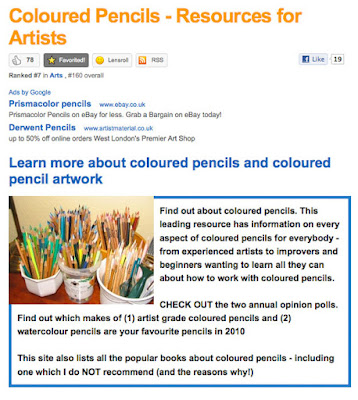
      UPDATE: Coloured Pencils - Resources for Artists


      I've recently been giving Coloured Pencils - Resources for Artists a major overhaul.  This post is by way of:
      • a major update on what's changed and 
      • a request for information about reviews which you've done (or seen) and which might be suitable for inclusion in this leading resource about coloured pencil art.
      While I independently search for and include links to websites providing good quality information, I also welcome hearing from people who think they've got a link to a site which might be suitable for inclusion in this resource.  See bold sentences below for the type of information I'm looking for.

      The major changes I've been making are listed below.  Click the COLOURED LINK IN CAPITALS to get to visit that section of the site.

      ARTIST GRADE COLOURED PENCILS - BRAND INFORMATION

      This is now organised so that brands and news/reviews relating to each individual brand are grouped together.  (see also Updating Coloured Pencils which comments on websites of manufacturers)

      If you've done a review of a individual brand of coloured pencils please let me know.  My preference given the new layout is one brand per review.

      If you've done a lightfastness test of your coloured pencils and this is not listed please let me know.

      COLOURED PENCIL ART SOCIETIES & EXHIBITIONS

      This includes coloured pencil art societies across the world.  It also makes some of the links on the national society websites a bit more visible eg in relation to past exhibitions

      If you have a coloured pencil art society - or local group - which is not listed please let me know.

      HOW TO DRAW - USING COLOURED PENCILS

      I've reorganised all the tips and techniques into more sensible sections and in doing so have identified some gaps in information which I'm trying to fill.  At the same time I'm always keen to be able to include links to high quality information about instruction.

      This is the new list of sections:

      Please let me know if you've written a blog post or website article  or created a pdf free to download file which relate to any of these aspects - and which you would like to be considered for inclusion.

      The last major part of the site relates to different subject areas

      In each of these I identify the websites and blogs of leading artists in each field together with relevant books, workshops and online tutorials

      If you have a tutorial which might be suitable for one of these sections please let me know.

      and finally......

      I'd very much like to thank the very many people who have given this site a "thumbs up" on Squidoo and/or linked to it on Facebook - BEFORE the facelift!  I'm very gratified to find so many people appreciate this site.  I hope you also like the new and improved version.

      Monday, 20 September 2010

      Your favourite coloured pencil - an update

      551 people have now voted on the Making A Mark 2010 POLL: Which is the best brand of artist grade coloured pencil? on Coloured Pencils - Resources for Artist.  

      Current votes show a quite dramatic change in the overall numbers when compared to the percentages as at 31st December 2009 - see Two new coloured pencil opinion polls for 2010 which has a chart for the previous poll.

      When disaggregated into brands in 2010, it's very clear that Faber Castell Polychromos pencils are the leading brand of coloured pencils and have a clear and significant lead over Prismacolor Premier pencils. 

      2010 POLL: Which is the best brand of artist grade coloured pencil?

      Detailed results are as follows:
      • Faber Castell Polychromos - their percentage of the market shows a small increase (28.7% compared to 27.3% in 2009)
      • In 2009 I just offered Sanford Prismacolor as one option and this topped the poll at 29.4%.  However what was taken to be a clear lead attributable to the popularity of Prismacolor Pencils now appears illusory given the percentage who like the Art Stix.  Overall there is a slight drop ion aggregated market share.
        • 17.6% for Prismacolor Premier in 2010
        • 1.5% for Premier Lightfast
        • 8.5% for Prismacolor Art Stix
        • 0.7@ for Sanford Prismacolor Verithin
      • Caran d'Ache retains overall market share - however it is now split across two brands
        • Caran d'Ache Pablo have dropped from 10.4% to 6.4% - a drop of 4%. 
        • However Caran d'Ache Luminance (an accredited lightfast range) - which were not offered as an option in the last poll - now count for 3.8%
      • Derwent was the only make in the previous poll where I identified the individual brands.  Overall to date Derwent has experienced a drop of 2.5%.  Changes to date are as follows:
        • 8.7% in 2010 for Derwent Artists - compared to 9.3%
        • 9.8% for Derwent Coloursoft - compared to 11.2%
        • 4.5% Derwent Studio - compared to zero
        • zero for Derwent Signature - compared to 2%
      • Lyra Rembrandt has reduced from 7.2% to 4.9% in 2010.
      • Royal Talens Van Gogh (an accredited lightfast range) has increased from 2% to 2.4% in 2010
      • Blick Studio Artists is a newcomer to my poll and takes  2.4%
      I'm trying to work out what the reasons for the changes might be.  Preliminary guesses are as follows:

      Technical sampling issues
      • small changes are more than likely accounted for by sample size
      • Last time the narrower range of options on offer probably meant people opted for whatever was the nearest option.  
      • Similarly the changes in pencil brands alone will account for some of the changes
      Marketing
      • Prismacolor seems to have stopped marketing its lightfast range (it's nowhere to be seen on its website) - which is odd given the relative success that Carann d'Ache have had in marketing the Luminance range which is not cheap!
      • The initial enthusiasm for Coloursoft is probably reflected more in the older poll and this one probably represents better the long-run demand level
      • I have an impression - and that's all it is - that American artists now experiment more with brands which are not Prismacolor.  
      • Overall, I'm guessing, but I think the more people order online the more likely they are to try brands which are not stocked in their local art shop
      Pricing
      • The sterling exchange rate is having a significant impact on the cost of some pencils for UK artists.
      • The exchange rate also means some products look better value to USA artists
        All suggestions are welcome as to any other possible explanations.

        I'll repeat this analysis after the end of the year and start a new poll for 2011.

        You can find out more about the different brands of artist grade coloured pencils on  Coloured Pencils - Resources for Artist - where you will also find a poll for watercolour pencils!

        Sunday, 19 September 2010

        Product review: Marc Dalassio's Vermillion Test

        Shop selling Sindoor (Vermilion) in Pushkar, Rajasthan
        I've only recently discovered Marc Dalessio did a colour test of different paints in relation to vermilion.  You can read about it here Color test: Vermilion and also see the colour charts which he created as a result.

        The purpose of the test was to find a red to use in portraits.  I've added in the relevant link to the paint in the quote from the post below
        For me the best of the hand-ground paints was Robert Doak’s vermilion, which I believe is either cut with cadmium if not entirely cadmium-based. That said it is extremely similar to the old Zecchi cadmium vermilion they stopped selling 8 years ago (which we all remember fondly). 
        Marc Dalassio

        You can find our more about Robert Doak specialised art materials and paints on his website - Robert Doak Colors.  He also does concentrated liquid watercolors which, according to the website, are brilliant and lightfast colors.

        Thursday, 16 September 2010

        Daniel Smith's Watercolor 66 Try-It Color Sheet

        Sometimes a manufacturer comes up with a new idea for how artists can try out their products which just make you nod your head and say "Yes!"

        This is one of those - and it comes to you courtesy of DANIEL SMITH.  This Try-It Sheet contains 66 paint-able "dots" of pure DANIEL SMITH Watercolor.


        I particularly like the fact that each colour is listed with information about:
        • its ASTM Lightfastness rating 
        • whether it is staining or non-staining
        • information about the extent to which it granulates
        • whether it is transparent, semi transparent/opaque or opaque
        You can either use the sheet as a reference for when you are choosing which watercolour paints you want to use from the DANIEL SMITH watercolor palette.  Or you can just wet the dot with a brush and try out the paint.  Or both!

        I've no idea how long this Try-It Sheet has been around, but I think Daniel Smith has just ramped up the "information for watercolour artists" stakes - in a very good way.

        Thanks to Billie Crain on Facebook for drawing this to my attention.

        UPDATE

        DANIEL SMITH sent me a message to (1) thank me for this blog post and (2) tell me that they have posted two useful videos relating to this product on YouTube - so here they are:

        Saturday, 11 September 2010

        Techie: Bloglines to close down 1st October

        My first ever feedreader was Bloglines - and I loved it.  However over time I gradually switched my feeds to Google Reader - and then found that I also picked up on people's blog posts increasingly via Blogger Dashboard, Facebook and Twitter.

        I guess a few other people must have been doing likewise as it's been announced that Bloglines is to close on 1st October.  Bloglines is owned by Ask.com and you can find their explanation for their decision here - Bloglines Update
        A little perspective: when we originally acquired Bloglines in 2005, RSS was in its infancy. The concept of “push” versus “search” around information consumption had become very real, and we were bullish about the opportunity Bloglines presented for our users. 
 
Flash forward to 2010. The Internet has undergone a major evolution. The real-time information RSS was so astute at delivering (primarily, blog feeds) is now gained through conversations, and consuming this information has become a social experience. As Steve Gillmor pointed out in TechCrunch last year , being locked in an RSS reader makes less and less sense to people as Twitter and Facebook dominate real-time information flow. Today RSS is the enabling technology – the infrastructure, the delivery system. RSS is a means to an end, not a consumer experience in and of itself. As a result, RSS aggregator usage has slowed significantly, and Bloglines isn’t the only service to feel the impact. The writing is on the wall.
 

        There is a a three-week period to export feeds to another service – more detail and instructions can be found on the Bloglines website.

        I've just moved all my subscriptions from Bloglines to a Google Reader and it took about two minutes - easypeasy! :)

        It's worth noting that the import/export tab for Google Reader is a tab within the Google Reader Settings tab rather than a line in the menu as it is with Bloglines. 

        Wednesday, 8 September 2010

        Review: Paint My Photo

        This is an initial overview of a new site called Paint My Photo - for those interested in painting from photos who also want to be able to access reference photos taken by other people to do this.
         
        A number of art forums have created photographic resources for their members - notably Wet Canvas's Reference Image Library (although this has been inaccessible for long periods on occasion).

        A new site has started up on Ning  - apparently independently of any major corporate interests which is interesting of itself - and it's all about painting from photos

        Not only that but it's set up deliberately to create a pool of photos for other people to use - and hence is called Paint My Photo  (subtitle - Where photographers and artists meet).  The intention is that reference photos supplied by photographers are copyright free and hence can be used by artists to produce art which they can sell without a fee to the photographer.

        Paint My Photo can be found at http://paintmyphoto.ning.com/

        The site seems to have been set up earlier this year and this is how it describes itself.
        What's The Idea?

        Very Simple, there are lots of great Photographers out there in internet land, and there are lots of Artists of all abilities who would like to paint from photographs. The problem is that Copyright law prevents this, although many photographers would love to inspire other Artists (Yes I do agree photography is an Art, I chose the terms 'Artists' and 'Photographers' for clarity). So-If you have posted photographs here, it is because you are happy to allow derivative works to be created. You still own the copyright of your photos of course. The Artist can, if the photographer has selected that option on joining, contact the Photographer to enable them to see the work. The Artist can sell their work as normal, if the photographer wants 'first refusal' on the Artwork, that should be by private arrangement and has nothing to do with 'Paint My Photo'. Artists can place links to where there work can be purchased. Photographers can place links to where other work and prints can be purchased. Anyone spamming and not following the spirit of the site will be warned and advised before any action taken.

        ****IMPORTANT!****
        We are a site for natural media only, no digital artwork, thanks for sticking to this rule.
        Features of 'Paint My Photo'

        Here are some of the features I could pick out:
        • over 7,000 photos already loaded onto the site.  However it's a little puzzling as the reference photos are mixed up with the digital images of the artwork created as a result so it's unclear how many photos there are altogether
        • 442 members to date - suggesting it's got enough to keep going
        • 22 videos loaded - usually by reference to a link to YouTube where people have chosen to share their videos
        • a monthly challenge - which tends to be a very popular feature on many of the forums targeting leisure artists.  
        • a forum - of the conventional sort with categories and threads.  This isn't as well advanced as I'd expect given the number of members. Thereagain a lot of interaction takes place by way of comments on individual photos and paintings.
        • Leader Boards - for content, members, photos and videos -  which allow people to see what's most popular at any given time - which is a good idea (but does I find tend to reinforce the popularity of 'early adopters')
        • a group for painting from photos.  Now as a Ning Moderator myself I'd personally have preferred to have set this up as a category within the Forum.  This would then allow people to start threads for their individual artwork - just like you get over at Wet Canvas.  Using the group function means that it's going to be very difficult to see anything other than what got posted today and people's work will get "lost" (as in difficult to retrieve) over time unless you're looking at that person's individual page.
        •  a very fascinating tool called a drawing grid - which looks amazing but I can't work out how it works!
        The one thing which struck me is that the position on copyright would benefit from a much clearer and more prominent explanation - maybe along the line of a FAQs document about what people can and cannot do with the photos they use.  From my perspective, I'd put an emphasis on people learning about good practice as well as what they can do when using other people's photos.

        It's also possible with Ning to get prospective members to look at something before people sign up and then ask when they agree to abide 'by the rules' when they join.  However from what I can see there's actually only one rule and that's 'don't create digital art'!

        What's good is that you can have a good look at the site before joining - and if this is something which interests you that's what I suggest you do.


        I'm not a member and would be interested to know how the people who are members find it.
        • What does it do well? 
        • Is it useful?
        • Is it likely to be a site that you'll use a lot?
        • What could it do better?

        Sunday, 8 August 2010

        Webware review: Blogger Stats

        Did you know that you can now get statistics in Blogger?  If you view your blog in Blogger in draft (http://draft.blogger.com) then you can now see a new stats tab to the right of the design and monetise tabs.

        This post on the Blogger in Draft blog explains what's available - see Introducing Blogger Stats

        I've been looking at my Blogger stats for my different blogs and I'm favourably impressed.  It reminds me of a cut down tidied up version of Google Analytics without any of the fuss associated with setting up a Google Analytics account for your blog and inserting the html code in the template

        Geographical spread of visitors to this blog
         The scope is as follows:
        1. Flexible perspectives:  Any of the different tabs can be viewed  for different timeframes - now, day, week, month and all time.  The latter is distorted due to the start date for the stats widget.
        2. Overview tab - provides a neat and simple summary of traffic, popular posts, sources of traffic and where in the world it's coming from
        3. Posts / Pages tab:  lists the 10 most popular posts and tells you how many pageviews they have each received.  Also indicates page views for individual static page.  I particularly like the pageviews for top posts as this gives a different perspective from one which is focused around visitors and the profile is somewhat different.
        4. Traffic sources tab: This provides the top referring URLs, referring sites and the most popular keywords
        5. Audience tab:  This provides a map of where visitors come from plus analyses pageviews by country, browser and operating system
        This is a quick overview:

        Pros
        • no set-up requirements beyond switching to viewing your blog in Blogger in Draft
        • nice clean well organised design
        • tab access to different perspectives
        • very accessible
        • identifies the most popular posts by pageviews (across different timeframes)
        • provides the right level of information for most people
        • no need to leave your blog in order to view the stats.
        Cons
        • not as comprehensive as Google Analytics (but absolutely fine for most people)
        • no details for individual visitors (such as you get with Statcounter)
        • focuses on pageviews rather than unique visitors hence multiple visits from or page refresh by one person can inflate numbers.  Most people measure the popularity of a site by unique visitors as this is more reliable and less susceptible to distortion
        • total numbers for the "all time" dimension appears to be affected by when this webware started to be used
        Overall

        This is a very useful addition to Blogger.  So much so that I've now made Blogger in draft my defaul view so I can keep an eye on my stats.

          Friday, 23 July 2010

          Product Review: Talens Van Gogh Coloured Pencils

          Set of 60 Talens Van Gogh Pencils
          An artist wrote to me yesterday commenting on how much he liked Talens Van Gogh coloured pencils but how difficult they were to find in the USA.  He'd found a supply at his local art store and this is what he had to say
          I must say that now that I've found a set of the Talens Van Gogh pencils, I think I'm hooked. I could only get my hands on a set of 30 but so far they are wonderful. I need the rest of the colors and probably the watercolor pencils as well.

          I found a set sitting on a shelf getting dusty at a relatively local art supply shop. They had about a half dozen. They haven't been selling which may be partially due to no open stock to replace them.

          Potential US customers should scour their local art supply stores. They may have them. Also, ask about them. We need to increase demand or they won't come back

          When I found a supply at my local store (a US national art supply chain and mail order), the manager said they didn't sell and they have reduced what they are carrying (they no longer carry Lyra). He thought it partially due to price, partially due to no marketing and partially due to so many of the books on CP only mentioning Prismacolor and sometimes Polychromos.
          That last comment made me really sit up and think.  

          How many people buy pencils on the basis of what other people recommend?  Quite a lot I should think.  Well if Prismacolor and Polychromos are the only brands which ever get mentioned by artists who write books, is it any wonder they tend to take the lead in all my polls about Which is the best brand of artist grade coloured pencil?

          The thing is, I believe people say what they're using is good if they are happy with that brand - even if they've never ever tried any other brands!  However to my mind, being happy with what you've got is insufficient grounds for saying that this brand is the best

          I've tried every brand of coloured pencils and I think there are pros and cons to all of them.  I really like my Van Goghs.  They're not as robust as the Polychromos and the pigment strength of the Caran d'Ache Luminance are doing a very good job of wooing me at the moment (one pencil at a time due to how expensive they are due to the exchange rate!).  However if it were a straight fight between my Van Goghs and Prismacolor Pencils, I know I'd choose the Van Goghs every time. 

          I decided to resurrect my 2007 review of Talens Van Gogh Pencils and give it another airing on this blog!  So here it is - rejigged into the product review format I use on this blog.

          ProductRoyal Talens - Van Gogh Pencils (Artists and watercolour)
          Summary:   Excellent coloured pencils which are difficult to find but well worth the effort.  If you ever get a chance to try Van Gogh Coloured Pencils, you'll be very pleasantly surprised. I'm very happy to recommend them.
          Technical Details: Coloured Pencils with guaranteed lightfastness.  They helped set the standard for lightfastness for coloured pencils having participated in the original tests.  Pigments held in mainly kaolin/wax provide good saturation with smooth application and good blendability
          Who should buy these pencils?
          • coloured pencil artists
          • artists who enjoy dry media
          • all CP artists who are convinced that Prismacolors are the only brand worth having!
          Who should not buy these pencils? 
          • devotees of the brush!
          Highlights:
          • Talens participated in the very first ASTM test of lightfastness in coloured pencils and the Van Gogh pencils are guaranteed to be lightfast.
          • Excellent pigment strength; lots of scope for getting saturated colour quickly
          • Kaolin/wax base for artists coloured pencils (blue top) gives very smooth and workable application - creamy soft.
          • Watercolour pencils have kaolin base and are only slightly drier in application.
          • Range of colours is not as extensive as other makes - but the range available is a very good choice. I find I always want to use their colours a lot.
          • Blend easily
          • Excellent range of greens and blues - very useful for the plein air sketcher
          • the Van Gogh watercolour pencils (white top) are the best I've come across so far - very quick to dilute to a clean wash
          • Wood used for pencils is responsibly sourced
          • Provides a safety data sheet
          Think Again?
          • Very soft pencils which sometimes get eaten rather fast by sharpeners
          • I'm in two minds about the white pencil, others do it better
          • Unfortunately the website does not provide a list of colours
          • European company and european bias to suppliers
          Manufacturer / Distributor:  Royal Talens Sophialaan 46, 7311 PD, Apeldoorn, the Netherlands P.O. Box 4, 7300 AA, Apeldoorn, the Netherlands
          Telephone +31 (0)55 - 5274700 Telefax +31 (0)55 - 5215286 www.talens.com
          Suppliers: 

          • You can find suppliers which sell Talens goods on the Talens website.
          • It's quite difficult to get hold of these pencils in the UK and virtually impossible to find them in the USA. Which is surprising given how good they are and that they are guaranteed lightfast. 
          • I'm very lucky in having Paintworks, the main importer to the UK located very close to me and hence I can buy colours from open stock for both artists and the watercolour products. (They also do mail order both for single colours and tins - you can find prices quoted in the 2010 drawing catalogue)

          The website also has a tips section for using coloured pencils and even has an outline and then an approach for using their coloured pencils to draw Van Gogh's famous painting of his room in Arles! You can download it from here.

          Note: For general information about lightfastness in coloured pencils and specific information about all reputable brands of lightfast pencils see various links on Coloured Pencils: Resources for Artists.
          Links:

          Friday, 16 July 2010

          Book Review: 100 Great Artists


          Title:

          100 Great Artists: A Visual Journey from Fra Angelico to Andy Warhol

          Synopsis: A list of 100 artists through the ages. Each artist gets a double page spread, a timeline, two images and a short narrative.  Recently published in the UK
          Summary review:  This book is good introduction to great artists for a reasonable price.  There is no definitive list of 100 great artists but this one is a good effort.  It's also a good place to start for those wanting to learn more about the leading artists over time.  Their importance is distilled down to a potted version - but it's a good book for getting a sense of who the artist was, when and where they created art, what their paintings look like and for some - why they were important.
          Highlights
          • covers different periods in art history over eight centuries from Giotto in the 13th century to Hockney in the 21st.
          • includes artists from a range of countries
          • useful for a skim review of artists who played a significant role in the development of some aspect of art
          • good quality publication - although not all reproductions first rate however.....
          • ....this is NOT an expensive book (less than £10 from Amazon)
          Think Again?
          • artists listed alphabetically rather than chronologically - latter might have been more helpful
          • limited coverage of the twentieth century - probably limited by the publishers budget for images for modern and contemprary artists
          • leans towards a European perspective of art (but does also include non Europeans eg Hopper, Hokusai and Hiroshige)
          • a few odd choices of artists I've never heard of with a limited claim to the top 100 / does not explain the reasons behind all the choices
          Who should buy this?:
          • new students of art history
          • those wanting to learn more about leading artists across the ages
          Who should not buy this?
          • of limited interest to those wanting specialised information about specific artists
          • unlikely to impress those who know quite a bit about art history
          Author: Charlotte Gerlings
          Publisher
          / Publication Date:
          • UK - Arcturus Publishing (31 July 2009)  Originally published 2006.
          • USA - Published by Gramercy (February 7, 2006) Amazon link
          Technical data: Paperback -  208 pages

          Monday, 12 July 2010

          Which is your favourite make of hard pastel?

          Conte à Paris and Cretacolour - in the Sennelier Shop in Paris

          When we think of pastels we often tend to think of soft pastels.  However hard and semi-hard pastels have a place in the art supplies of any decent pastel artist.

          The main characteristic of hard pastels is that they tend to have less pigment and more binder.  As a result colours tend to be less vivid and works completed only in hard pastels can seem subdued when compared to the intensity of some of the hues of 'proper' soft pastels with high pigment concentrations.  The higher proportion of binder can also make some brands seem very dry and scratchy and it's always worth trying different brands to find the one you get on with best.

          The chalks used for classic drawing tend to be closest to hard pastels and a number of manufacturers provide a set of hard pastels in the classic drawing colours of sanguine, sepia, black and white. 

          Using hard pastels

          Pastels artists use hard pastels for a number of different purposes including:
          • preliminary sketches
          • sketching in under-drawings (as with the oil painting principle of "fat over lean")
          • creating outlines
          • getting a hard edge on top of soft pastel
          • flat surface used to rough in large areas
          • edge used for expressive lines or crisp lines
          • adding in intricate details (usually with sticks which have been sharpened to a point)
          Different Brands of Hard Pastels

          These sticks are typically rectagular with hard edges.   In French, the sticks are described as carré ('square' in French).
          LEFRANC &; BOURGEOIS distribute the CONTE à PARIS fine art range of pencils, crayons and pastels. Conté crayons are most commonly found in black, white, and sanguine tones, as well as bistre, shades of grey, and other colors and are particularly suitable for fine hatching. They also produce 70 colours.
          The website states: POLYCHROMOS pastel open up an almost inexhaustible variety of colour. They contain a high proportion of light-fast quality pigments. These pastels have impressively bright colours and a fascinatingly silky "feel".....The characteristic square-cross section allows you to draw fine details with an edge, or shade extended areas with one face. The crayons have a uniform consistency, are economical in use, and adhere excellently to paper, card, wood, and stone. They need only a minimum amount of fixing for permanence.
          The website states: Artists' quality for every level of expertise.  Rich, creamy pigments for easy blending and shading.  Stronger than traditional soft pastels create less breakage and easier clean-up.  Ideal for illustration or tightly rendered drawings
          From the website: The square (carré in French) CRETACOLOR hard pastels have been recognized by artists all over the world for their brilliant colors and high pigmentation. Their square shape lends itself well to painting both large surfaces and small details. The Pastell carré hard pastel full range is 72 colors, including the Brown and Gray Chalks.
          Artists' Hard Pastels Daler-Rowney Artists' Hard Pastels are characterised by a velvet smooth mark, which stems from the carefully prepared blend of pure pigments. Firm in consistency, these pastels can be used to produce broad, flat areas of colour and detailed line work with equal success. 24 colours 
          Van Gogh carré pastels fall into the category of dry pastels. They come in a square shape and are made of pigment, various types of clay. Only available in assortment sets.  
          From the website: For authentic pastel drawings with quick, easy colour lay down, these chunky pastel blocks are perfect. Their square shape and smooth, semi-hard texture means you can use the ends, sides or edges to produce both broad and fine lines. Although not as dusty as soft pastels, the effect is equally beautiful and perhaps a little more manageable. Derwent Pastels are available in a range of 36 vibrant colours, plus the unique Derwent Blender which allows easy blending without affecting the colour density.  
          From the website: Professional, semi-hard pastels, perfect for underpainting.  
          General's® Classic Pastel Chalk Set contains 31 pieces
          One of the factors to think about when buying hard pastels is how easy it is to replace singletons from open stock.  Some brands are only sold in sets.


          Which hard pastel do people like the best?

          I've had a opinion poll running for some time on my information site Pastels - Resources for Artists. It asks the question Which is your favourite make of hard pastel?

          To date 270 people have responded to the poll and indicated their preference as to harder pastels and the percentage of their votes are shown in the chart below.  The current poll has a limited range of options and I'm thinking of setting up a new one including the complete range of hard pastels.
            
          Opinion Poll (270 responses as at July 2010)

          By far the most popular 'hard pastel' is Prismacolor Nupastel, although interestingly this is one of the softer hard pastels!  You can't find these in Europe so I'm assuming this is an overwhelming vote from American readers.  Similarly I guess many Americans may find it difficult to check out European makes of pastels.


          Which is your favourite brand of hard pastel - and why?

          I'd be very interested to hear your views about the different pastel brands - please do leave a comment.


          Link: Pastels - Resources for Artists
          Related Posts Plugin for WordPress, Blogger...