Showing posts with label art. Show all posts

Sunday, 2 February 2014

The price of paint

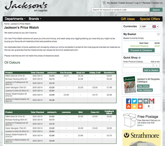
Jackson's Art Pricewatch Scheme is the sort of marketing effort by art supplies companies which impresses me. 

Jackson's Art website page for the Pricewatch Scheme

Pricewatch Scheme

Our dedicated team of price watchers will constantly check our online competitor’s prices for the most popular branded art materials so that we can guarantee that the lowest prices can always be found at Jacksonsart.com
I'm a committed buyer of goods from John Lewis and one of the reasons I do is because they promise to match the price of the same goods on sale somewhere else so that they always offer the lowest price on normal (ie not clearance) stock.

A commitment from art supplies companies to introduce a price watch comparison service has been long overdue.

The Jacksons scheme is not perfect.  They've picked popular products and very reasonably have matched it against "competitor websites chosen on the first search results for the term ‘art supplies’ on Google.co.uk"

Which means it doesn't cover every product and it doesn't cover every competitor - but it's a start.

It could also mean that art supplies companies start to look very carefully at the price they're charging and introduce a bit more competition into the marketplace.

However, one might be forgiven for not being aware that the system actually exists.  They don't exactly shout about it on the front page of their website!

In fact, it's new and if I hadn't read their 24th January blog post Price Watch scheme I wouldn't have known anything about it.

To my mind, the quality of this scheme will depend on reliable reporting and updating of prices across the board. I could imagine other art suppliers becoming very annoyed and even litigious if their prices are misrepresented in anyway - that's if the Trading Standards people don't get there first!

My conclusion is that it's good to see somebody trying this approach - let's see how it works in practice before arriving at any conclusions about the scheme as a whole.

Cost of shipping


My normal caution to individual artists when comparing prices for art materials is 'ALWAYS look at the cost of shipping' because of the scope for suppliers to balance losses on cutprice goods with premiums on shipping costs.  I've certainly spotted suppliers in the past who have operated according to this strategy.

In this instance I note Jackson's Shipping Information indicates all shipping - at UK standard postage rates - is free once you've topped £39.  The usual sort of premiums apply to the Islands and Ireland.


Tuesday, 29 October 2013

Review: The Vanity of Small Differences

Grayson Perry's exhibition of the tapestries which make up The Vanity of Small Differences continues its travels around the UK .  This work is so good it gets its own tour of the UK! It's now reached Manchester City Art Gallery where it will be on display until 2 February 2014. Well worth visiting if you can get to Manchester! (More details at the end of future tour dates!)

The tour prompts me to review the Catalogue of the tapestry project of the television programme. I'm really pleased to have been sent a copy of the book of The Vanity of Small Differences for review.

Front Cover of the book of the exhibition of the tapestries arising out of the television series!
by Grayson Perry
Published by Haward Publishing

Background: A brief synopsis of the artwork and how it came about

The Vanity of Small Difference is a very important piece of contemporary art - which was conceived as a public work of art. It comprises six Tapestries listed below together with links to Grayson Perry's explanation of what the tapestries are about.
The piece explores British taste. It's a contemporary version of Hogarth's 'Rake's Progress' and also reprises classic artworks (puns in the titles of tapestries provide clues!) in contemporary form. It all started with a safari around UK. Grayson Perry visited different groups of people - in Sunderland, Tunbridge Wells and the Cotswolds - which resulted in a BAFTA award-winning Channel 4 series ‘All in the Best Possible Taste with Grayson Perry’ (2012). His visits to places strongly identified with social classes investigated the taste of the different tribes of people in terms of class and social mobility and unearthed more than a few surrprises.  

The other thing you need to know is that Grayson Perry is very intelligent, acutely observant of contemporary mores - and finally, he's truly astonishing in the way in which he manages to be both very articulate with very accessible.  I'm a  huge fan!

Synopsis:  This book is the catalogue of the exhibition of The Vanity of Small Differences - an iconic piece of contemporary art based on research by Grayson Perry into contemporary taste, social class and class mobility. It tells the story - and shows us the processes - of how he developed tapestries telling the story of Tim Rakewell and his progress through life to his death. The name is a link to the Tom Rakewell of the Rake's Progress. The book explains how the tapestries came about and provides a commentary on what they reveal.
Summary review:  HIGHLY RECOMMENDED: This is an essential guide to a multi-layered, culturally rich and very important set of tapestries. A contemporary tale, an iconic artwork - and an interesting story about how the tapestries were produced plus excellent publication values all combine to make this both a very interesting and a very high quality publication. 
Average customer review
Highlights
  • a visual narrative of what it is to be English today - in terms of taste and associated visual aesthetics 
  • a great read - in terms of the essays. A stronger sense of the morality tale which underpins some of the narrative of the tapestries. 
  • the research is represented by a portfolio of annotated photographs - with some surprising captions
  • Perry's sketchbooks are a delight. In these he developed the themes, the storyline and finally the sketches for the tapestries. Plus added annotations about the artwork and notes of key themes for individual tapestries.
  • Superb illustrations of both tapestries and details. each individual tapestry enjoys a folded panoramic pullout - which means we get to see them very much bigger than the size possible on a conventional page. Plus details enable one to see the way the tapestries are woven and how the colour transitions work - which is an aspect I found particularly interesting - scumbling on a loom! Plus who knew that looms are now digital and can produce a large tapestry in about 5 hours?
Think Again?
  • Those who have no connection with figurative artwork or social commentary 
  • Those who have no interest in the fascinating process which generated the tapestries
Who should buy this?:
  • Fans of Grayson Perry - whose fan base seems to be increasingly exponentially. He's on his way to becoming a "national treasure" if not there already! 
  • people who want an example of how to be unique; how to make art which is different
Who should not buy this?
  • Those not interested in tapestries, contemporary art or social comment
Author: Grayson Perry
Publisher: Hayward Publishing (UK 10 June 2013 | USA 31 October 2013)
Technical data: Hardcover| 128 pages | 21.5 x 25 cm | 120 colour and black and white illustrations
  • ISBN-10: 1853323152
  • ISBN-13: 978-1853323157
Paperback: No
Available as an ebook? No - however an app about the Tapestries is available 


Digital guide


The Arts Council Collection have created an app for iPad and iPhone. This gives you commentary on Perry's perspective, details art historical references and provides a guide to the making of the works. You can see the tapestries up close with detailed zoom facility and have Grayson's own audio guide. Reproductions of the classical referenced artwork are disappointly tiny. They work better when accessed via the interactive aspect of the app.  The bonus is Grayson Perry reading the words associated with each tapestry and highlighting the similarities between classical painting and his tapestry.

The digital guide,Grayson Perry: The Vanity of Small Differences, is available only on the App Store (£1.99).

The Vanity of Small Differences - The Tour

Exhibitions to date


These include the following. The link in the title is to the exhibition page at that location.
  • Gallery I Victoria Miro, 16 Wharf Road, London N1 7RW (7 Jun - 11 Aug 2012)
  • Sunderland Museum and Winter Garden - the location for two of the patesries  on 28 June, as part of the Festival of the North East which celebrates the return of the Lindisfarne Gospels to Durham Cathedral. It is of particular significance that the works begin their public tour in Sunderland as this is where Grayson sets two of the tapestries, The Adoration of the Cage Fighters and The Agony in the Car Park. 
  • Perry’s own edition of The Vanity of Small Differences was displayed as part of the Royal Academy of Arts Summer Exhibition 2013 (June - August 2013) - see my review 10 reasons to visit the RA Summer Exhibition 2013 - my #1 reason was the set of tapestries which got a room to themselves.
  • Manchester Art Gallery (24 October – 21 January 2014)

Future Tour Dates:

  • Birmingham Museum and Art Gallery (14 February – 11 May 2014), 
  • Walker Art Gallery in Liverpool (May – August 2014) and 
  • Leeds City Art Gallery (1 August – 1 October 2014). 
  • An international tour will follow. 
The Art Fund and Sfumato Foundation are supporting the UK tour of the tapestries, as well as education and interpretation materials for the UK tour

Saturday, 14 September 2013

Print on demand: top choices are Zazzle and Fine Art America

Zazzle and Fine Art America are the most popular choices of artists using print on demand services for their artwork.  

Print on demand is a service where you upload an image and a company fulfils all orders for a giclee print, invoices, processes payments and despatches the print on your behalf - for a fee.  many artists like it as they can make money from their artwork even if the original has been sold and can spend more time on making art and less time on doing the administrative aspects.

However print on demand doesn't just happen - just as with original art, you still need to work at the marketing!

But which site offers the best service?

My poll which investigates which print on demand service artists like best has been running on my website dedicated to Print Art on Demand - Resources for Artists since last August.  You can see it below.

POLL: Which "Print on Demand" site for art prints do you like the best?

Poll ran for 13 months
from 14 August 2012 - 14 September 2013

The poll ran for 13 months between August 2o12 and Sepetmber 2013. I'd have liked the poll to have been bigger - that said it still represents responses from 64 people, some of whom have also left comments on the website.

Key results
  • Zazzle managed to snare nearly a third of the print on demand clients 
  • a quarter opted for the services of Fine Art America.
While the traffic for Cafepress and Zazzle is ostensibly similar, it's very clear that Zazzle is the site of choice for smaller and less fine art oriented items with images. Zazzle continues to remain very popular with artists wanting to sell at the 'popular art'/low priced end of the market

Upon further investigation, while there's not that much to choose between them in terms of traffic in the summer months, Zazzle absolutely thrashes CafePress at Christmas with some 2 million more visitors (9+ million compared to CafePress's 7+ million).  So if you want customers for your art at Christmas you might want to give Zazzle a try.

Zazzle also has the snazziest looking website - which is bang up to date.  It's already got its offerings up re. putting artwork on the new iPhone cases on its home page!

Redbubble is close to the Zazzle and Cafepress end of the market - however the general consensus is that this once popular Australian based firm has maybe peaked.  It's been giving an impression of a site which lost its way in business terms.  The website also has a more conventional look about it. A number of people have been looking for other venues since they changed the way they do business.

Fine Art America is a more popular choice for those wanting to sell fine art prints of their artwork on demand - with the company doing all the necessary to fulfil the order.  One of the aspects artists appreciate is the fact that they can choose whether or not Pinterest can pin their images or not - it's their choice, not a choice made for them by the website.

What I like about Fine Art America is that all the basics are explained - with a decent amount of detail - all on one page.  You also have the chance to sell prints direct from your own website.  With a premium membership you can also sell your art via Amazon.com.  On the other hand, its sop site is by far the most traditional looking and is likely to attract an older customer.  In my view, Fine Art America could do with reviewing how its site stacks up compared to the competitors.

My original choice of website for prints (Imagekind) was spot on in terms of quality of print - and absolutely dreadful in terms of their business model and their overall approach to growing the business.  So while you can see my prints via my website I have been giving some thought for a while to switching to a new provider.

I'm not really into selling mugs and mousemats so I'll probably skip Zazzle and give Fine Art America another close look.  I'm also going to check out some of the photography websites which have well organised ecommerce options and will then review the options.

One thing I would say is if you've not given ALL their websites a once over for quite a while, I think you'll notice quite a bit of change.  Maybe time to take another look?

Please share your views


Please let us know your experiences of different print on demand websites either here or on Print Art on Demand - Resources for Artists

Monday, 20 May 2013

2013 POLL: Which is your favourite make of artist grade soft pastels?

I'm monitoring your favoured brands of pastel and I'd appreciate it if all pastel artists click this link 2013 POLL: Which is your favourite make of artist grade soft pastels? to visit my website Pastels - Resources for Artists and vote on the BRAND NEW POLL for your current favourite make of soft pastel.

Is it the same as in previous years or have you switched allegiance recently?

Kremer Soft Pastels
I've edited the choice of soft pastels this year to those which are currently available in open stock and rated as artist grade soft pastels. That means:

PASTELS ADDED

PASTELS DROPPED

  • Blick (student grade), and 
  • Winsor & Newton (no longer listed as an available product as per 2013 website)

PASTELS AMALGAMATED

You can see the trends in terms of the popularity of different makes of soft pastels in yesterday's post Unison is still favourite artist grade soft pastel.

Unison certainly take some beating - they've been top in each one of the four polls I've run to date - however the ranking of the top five pastels changes on a regular basis.

Saturday, 13 April 2013

Unison Pastels - Colour Charts

I came across an offer of three handmade laminated colour charts for Unison Pastels made by Unison Colour this morning.  It struck me I'd never done a post about Unison Pastels colour charts - so here it is!

Colour charts - and colour charts for pastels


Colour charts are available in a number of different ways.
  • printed - needs to be matched to CMYK colours to get the colours right
  • digital file - to be viewed on screen hence needs to be matched to the RGB colours (but then it will be wrong if printed out as it won't be set up for a CMYK colour scheme!)
  • handmade - "as is"
See my Colour Theory for Artists site for the RGB (light) and CMYK (print) processes referenced above.

Inevitably, a printed colour chart is easy to produce but does not always match up with real colour.  This is one of the reasons why Old Holland Oil Colours have a hand painted colour strip on each tube of paint - so that the purchaser of an expensive paint can see the real colour when laid down.  It's why some manufacturers produce hand-coloured paint charts.

However when it comes to pastels there's a problem.  A hand-coloured chart cannot be stored either by the retailer or the consumer as the pastel will be rubbed off.  One pinned up in a studio will come to no harm - but these are probably best produced by the artist for the colour range they use.

Unison Pastel Colour Charts

Normally I access colour charts for Unison Pastels by looking at their website.  Unison have colour charts available as a printed chart (which you can obtain by emailing them) and on-screen colour indexed charts.  Both sets of charts are for their:

Unison Pastels - Colour Charts - Heavenly Shadows
Unison Pastels - Colour Charts
Colour Sets
AND for their

Selection Sets
AND for their

Half Stick Sets

Retailers' sets


I never buy retailer's sets unless I can see the index number itemised for every colour in the set - on the basis I've probably already got them!

JACKSON ARTS


A couple of special selection sets are available via Jackson Art where they provide good images of the colours - but no listing as to the index numbers of the colours chosen.

John's Set is apparently a set of the last colours that John Hersey made prior to his death.

The Ann Oram Set of 30 Half Sticks is new and you can read about it here on the Jackson Arts Blog - New Ann Oram Unison Soft Pastels Set.  Ann Oram taught a still life worksop at Unison's in Northumberland in 2012.
Unison Pastels - Southwest Colors
Colour Chart by photograph: 
Unison Pastels - Southwest Colors 

DICK BLICK


Dick Blick in the USA are excellent at listing the sets and associated index numbers of all pastels in each set that they stock.  They also list a number of sets which are available in the USA but not in the UK (see below)

Colour charts are available via photographs of the different sets in which the colour index number can be clearly seen. I'm not sure they have photographs for all the sets they retail.

Here, for example is the Southwest Colors set which is one I nearly bought in 2006 when making a trip out to the South Western States of the USA (see USA Sketchbook - Southwestern States (2006))

The sets they list include:

Portrait Colors: African American | Asian | Caucasian | Latino | Mediterranean | Native American | Portrait Eye Colors

Landscape Colors: Desert Sunset | Northern Sunrise | Polar Ocean | Tropical Ocean | Southwest Colors (includes the Turquoise set of 6)

Artists Colors: Brenda Mattson Portrait

JACK RICHESON


Jack Richeson has a printed color chart of all 402 colours (pdf file) that he stocks.  He uses it to relate the Unison names for Colour Sets to the sets he stocks.  On screen it looks like a pretty good match with the colours in the Unison sets.

Glyn Rand Colour Charts


This morning I discovered the existence of the handmade laminated colour charts for Unison Pastels made by Glyn Rand. He emphasises that his  product is neither affiliated to Unison Colour, nor is it endorsed by them.

A handmade chart gets round the difficulties associated with the RGB/CMYK processes which have to translate colour in reality into another medium of vision or print.

By completing the charts using the pastels and then laminating the charts, these should in theory be the best match with various Unison Pastels.

However there is a BUT....

Actually there are two BUTs....

Unison Pastels - Glyn Rand Colour Charts
Unison Pastels - Glyn Rand Colour Charts (Size A3 x 3)

The "But" is because my conclusion about this product is essentially "Nice idea, shame about the execution - and the price".

Why?

BUT.... #1

Well, the charts are NOT set up diagrammatically to provide a clear index of each 18 colour set.  Instead of 18 colours in a vertical column Glyn has chosen to go with just 16.  This means that:
  • the colour sets are spread across different columns.  
  • all the values are mixed up.  If looking for a light tone and colour you can't scan the bottom of the chart and the light set - as the lights are all over the place.
This would personally drive me absolutely potty and I couldn't look at them - I like my colours rigidly organised according to colour and tone because that allows me to work in an effective way.

In fact every pastel artist I've ever known had all their pastels organised on two dimensions - by colour and tone.  I can't think of any reason why any of them would want a colour chart which wasn't organised in the same way.

BUT.... #2

Personally I think the price of £30 for the three charts is a bit steep when one considers that a laminating machine for A3 paper only costs around about £30 on Amazon!  I don't think a product should ever prompt one to think about buying the kit required to produce the end product rather than the product itself!

If you've already got a lot of Unison Pastels - as I have - I'm drawn to conclude that :

  • if you're not bothered by tonal values being all mixed up and don't think you'd have any use for a laminating machine - have a think about the charts
  • produce your own if:
    • you don't like your tonal values mixed up.....
    • and/or think you could find a laminating machine useful

More about Pastels


You can read more about Pastels on my websites
Saturday, 16 February 2013

The Favourite Watercolour Pencils Awards! (2012 Brand Poll Results)

This post is about my Annual Poll to determine the best brand of Watercolour Pencil on the market from those available to purchase at the beginning of the year.

Once again Faber Castell is the market leader in terms of both market share and the favourite watercolour pencil.

The Favourite Watercolour Pencils Awards 2012
  1. Favourite Watercolour Pencil in 2012 - Faber Castell Albrecht Durer
  2. Favourite Woodless Watercolour Pencil in 2012 - Joint Winner: Cretacolor Aqua Monolith & Derwent Aquatone
  3. Favourite brand of Watercolour Media in 2012 - Faber Castell
The results also indicate that wood pencils are more popular than woodless pencils and that the market for woodless pencils appears to be shrinking over time.
Results of the Annual Poll on Coloured Pencils - Resources for Artists
This poll was first introduced in 2010 when 144 people voted. 125 people voted in 2011 while only 64 people voted in 2012 on my 2012 POLL: What's your favourite watercolour pencil?.  The poll is now closed.

Here's a table of the results over the last 3 years
FAVOURITE
2012
2011
2010
Watercolour Pencil
Faber Castell Albrecht Durer
Woodless Watercolour Pencil
Cretacolor Aqua Monolith
&
Derwent Aquatone
Caran d'Ache Neocolor
& Derwent Aquatone
Caran d'Ache Neocolor & Derwent Aquatone
Brand of Watercolour Media
Faber Castell
Faber Castell
Derwent and Faber Castell

Below is a table indicating the actual numbers across all products for the percentage market share - of those people who responded to the poll.

It's very clear from this relatively small sample that Caran d'Ache and Derwent's results have reduced while Faber Castell has grown its share of the market.

A growing interest in Faber Castell is to my mind entirely consistent with more and more coloured pencil artists becoming aware that the favourite watercolour pencil is the Faber Castell Albrecht Durer. It's way out in front of the rest.  I'd always expect growing awareness of what people like and recommend to influence the buying patterns of those trying new media for the first time.

Table: Manufacturers percentage share of respondents
Watercolour Pencil Manufacturers
2012
2011
2010
(all brands)
%
%
%
Caran d’Ache (all brands)
9.4
18.4
20.9
Cretacolor
3.1
3.2
1.4
Daler Rowney
4.7
0
0
Derwent (all brands)
18.8
27.2
34
Faber Castell Polychromos
40.6
32.8
34
General’s Kimberley Thin Lead
6.3
0
0
Lyra Rembrandt
1.6
4.8
4.9
Sanford Prismacolor
7.8
6.4
4.9
Staedtler Karat Aquarell
4.7
2.4
0
Royal Talens van Gogh
3.1
4.8
0
100
100
100

We do however need to remember that the results in part are ALWAYS dictated by the fact that not all brands are well known or easily available in local art shops.  However all are available from online suppliers (see below for links to Art Suppliers in the UK and USA) and I'm trying to enhance awareness via the 

I'm minded to ponder on the fact that CPSA banned from use of the Caran d'Ache Neocolor II for their main international exhibition in 2012.  To my mind it is to all intents and purposes exactly like other woodless watercolour pencil type media.  I have yet to come across a convincing argument as to why this medium is not allowed other than the fact it uses the word 'pastel' wjile others describe it as a crayon - while being neither a soft pastel nor an oil pastel!  Could it be a question of language?

Those using watercolour pencils will be interested to know that the Colored Pencil Society of America (CPSA) also tests the lightfastness of all watercolor pencils and provide the results in their CPSA - Lightfastness Test Result Workbook Version 6

A new poll is now open and you can find it here - 2013 POLL: What's your favourite watercolour pencil?

Links:

Sunday, 16 December 2012

Learn how to pack, post and ship art

Have you ever found packing art or shipping art to be a bit of a challenge?

This is a time of year when a lot of artwork gets packed and mailed or shipped. Here's some polls from my website How to pack, post and ship art - Resources for Artists which highlight what most people find a challenge - and what some of the best solutions are in terms of which mail or courier service people like to use and will recommend.

POLL: Packing or shipping - which is the biggest challenge?

The top three challenges for artists are:
  • Which is the best mail / courier / shipping service (27.3%)
  • Which are the best packing materials (20.9%)
  • Where to buy good packing materials (16.5%)
POLL: Packing or shipping - which is the biggest challenge?
You can find lots of information and links to resources and yet more information on my website.
Given that choosing the best mail/courier/shipping service is such a major challenge, I have two more polls on this website which review which are the best post/shipping services in the UK and the USA respectively.

Here's a reminder of how the votes have been cast.

POLL: Which is the best post/shipping service for artwork in the UK?


Which is the best post/shipping service for artwork in the UK?


POLL: Which is the best post/shipping service for artwork in the USA?


Which is the best post/shipping service for artwork in the USA?
At the end of last year I also ran an independent poll and this also confirmed that Shipping art: FedEx is the most trusted service


Sunday, 18 November 2012

NEW Drawing Books in 2013

2013: NEW Books About Drawing is my new website which will track:

  • new drawing books in 2013
  • revised editions of some well regarded existing publications
  • new editions of some historical books about drawing.

Listings are on a month by month basis - as books are listed for publication (however note that its' not unusual for some of these dates to slip a month or two).

The books listed include:
  • art instruction books about drawing and sketching - designed specifically for artists working in drawing media and those keeping sketchbooks / journals.
  • academic books about drawing
  • catalogues for exhibitions about drawings
I don't include every book published and to be frank my aim is to try and identify quality publications rather than more "same as same as" books and those which I regard as dumbed down.

Perspective and Urban Drawing and Sketching

To be published by Wiley
in February 2012
For those who have difficulty drawing buildings and tackling urban sketching there's some books being published by Wiley early in the New Year which might provide help.  In February, Wiley is publishing:
Although their target audience is students and practising designers, architects, planners, and landscape architects, I'm sure there's bound to be content of interest for anybody who is serious about drawing buildings or anything involving perspective.  They've not got to the "see inside" stage as yet - but could be worth a bookmark for those who have an interest in these areas.

Art History

There are also a number of excellent books coming up about drawings by master draftsmen and famous painters.  Examples include:

To be published by D Giles Ltd
in January 2013
January 2013
February 2013
  • Raphael: Drawings - based on the remarkable collection of Raphael's works in the collection of the Städel Museum in Frankfurt.
March 2013
June 2013
  • Hopper Drawing (Whitney Museum of American Art) - this is an exploration of renowned painter Edward Hopper’s detailed compositional studies and figure drawings.  It also appears to be connected to exhibitions although I can't yet confirm this from the museum websites.  Here are the 'maybe' dates of the exhibition
    • Whitney Museum of American Art (05/23/13–10/06/13) 
    • Dallas Museum of Art (11/17/13–02/16/14)
    • Walker Art Center (03/15/14-06/22/14)
To be published by YaleBooks
in June 2013
This is what Yale Books (the publisher) have to say about the book
In 1967, Hopper's widow, Josephine Nivison Hopper, bequeathed her husband's artistic estate to the Whitney Museum of American Art, including a fascinating collection of more than 2,000 drawings spanning his entire career. This group of works has never been the subject of in-depth study and many have never been reproduced before. Hopper kept these drawings for personal reference as he revisited various themes throughout his career. Carter E. Foster carefully examines how Hopper used his drawings to develop his paintings, arguing that the artist's work can only be fully understood after in-depth study of these preparatory sketches. Foster also argues that Hopper was, in many ways, a traditional draftsman who methodically developed schematic ideas into detailed studies to refine content.
YaleBooks - Hopper Drawing by Carter E. Foster 
Commentary on Drawing

There's to be a revised second edition of the well regarded Vitamin D book - although I have to say Vitamin D2 doesn't have quite the same ring! 

Vitamin D2: New Perspectives in Drawing will be published in May 2013 by Phaidon and will feature contemporary drawing by 115 artists from around the world.

More drawing instruction and Andrew Loomis

The publishers of the venerable art instructor have not finished - we have one more. Fun With A Pencil by: Andrew Loomis was first published in 1939 and is going to be republished in April 2013 by Titan Books.

More Books about Drawing

Below you can find my other websites relating to books about drawing

The Best Books about Drawing and Sketching
Do you want to learn how to draw? Not sure which book to buy? Want to find out which are the best books about drawing and sketching? SCROLL DOWN to find lin...
2012: NEW Books About Drawing
This site lists BRAND NEW books about drawing and sketching due to be published in 2012 on a month by month basis and highlights major new books which I reco...
2011: NEW Books About Drawing
Find out about new books about drawing and sketching published in 2011 - in hardback, paperback and ebook editions. Listings on a month by month basis but ar...

Saturday, 10 November 2012

Studio Product: IKEA Råskog Kitchen Trolley

IKEA is proving to be a very useful place for providing equipment suitable for artists' needs.  My latest find is a Trolley called the Råskog Kitchen Trolley

One of the challenges of drawing with coloured pencils is getting my kit organised.  First I got my pencils into white painting tubs.  Then I got an IKEA Lazy Susan so that I can access them easily - however it would be nice to have all my other drawing equipment as easily accessible and in one place.  I've been thinking of getting a trolley - and spotted this one in the new IKEA catalogue.

IKEA Råskog Trolley

Specification

Materials: It's made of steel with an epoxy power coating.  These are the assembly instructions

Dimensions: The dimensions when assembled are
  • Width: 35 cm (13.8 inches)
  • Depth: 45 cm (17.7 inches)
  • Height: 78 cm (30.7 inches) - that's the equivalent of desk height
Price: It's priced in the UK at £50 - in the USA it's $49.99.  I'm guessing VAT accounts for the rather wonky currency conversion.

Looking at it online, here are the pros and cons from my perspective

Pros
  • I love the turquoise colour! (who needs grey?)
  • the shelves have edges meaning that "stuff" does not fall off and everything is held securely within the space
  • ease of access to shelving - no need to pull out a shelf
  • tubs of pencils can be swopped around between the shelves depending on what is in use
  • the castors mean it can be moved easily
  • the website indicates that the middle shelf is adjustable - however I think they mean it's optional
  • Steel means it's robust and can be cleaned easily (helpful for those wanting to use it for paint)
  • its dimensions means it doesn't swamp the area when you have it out and it can fit in small spaces when you want to put it away
Cons
  • the castors also mean it can move inadvertently - there's no obvious locking device to keep it one place
  • the base of the shelves is meshed steel which I'm feeling a little ambivalent about.  Good for veggies and ideal for losing small items? (Probably need to use cartons within the shelves for small items/ things which roll)
I'd be interested to hear from anybody who has bought one and/or anything similar which they'd like to recommend.

More about IKEA for the studio

Previous IKEA items - reviewed on this blog - relate to:
Related Posts Plugin for WordPress, Blogger...