Friday, 23 July 2010

Product Review: Talens Van Gogh Coloured Pencils

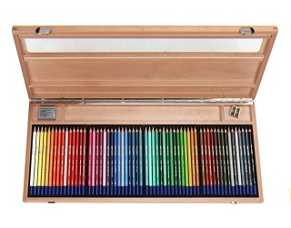
Set of 60 Talens Van Gogh Pencils
An artist wrote to me yesterday commenting on how much he liked Talens Van Gogh coloured pencils but how difficult they were to find in the USA.  He'd found a supply at his local art store and this is what he had to say
I must say that now that I've found a set of the Talens Van Gogh pencils, I think I'm hooked. I could only get my hands on a set of 30 but so far they are wonderful. I need the rest of the colors and probably the watercolor pencils as well.

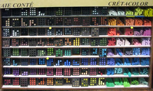
I found a set sitting on a shelf getting dusty at a relatively local art supply shop. They had about a half dozen. They haven't been selling which may be partially due to no open stock to replace them.

Potential US customers should scour their local art supply stores. They may have them. Also, ask about them. We need to increase demand or they won't come back

When I found a supply at my local store (a US national art supply chain and mail order), the manager said they didn't sell and they have reduced what they are carrying (they no longer carry Lyra). He thought it partially due to price, partially due to no marketing and partially due to so many of the books on CP only mentioning Prismacolor and sometimes Polychromos.
That last comment made me really sit up and think.  

How many people buy pencils on the basis of what other people recommend?  Quite a lot I should think.  Well if Prismacolor and Polychromos are the only brands which ever get mentioned by artists who write books, is it any wonder they tend to take the lead in all my polls about Which is the best brand of artist grade coloured pencil?

The thing is, I believe people say what they're using is good if they are happy with that brand - even if they've never ever tried any other brands!  However to my mind, being happy with what you've got is insufficient grounds for saying that this brand is the best

I've tried every brand of coloured pencils and I think there are pros and cons to all of them.  I really like my Van Goghs.  They're not as robust as the Polychromos and the pigment strength of the Caran d'Ache Luminance are doing a very good job of wooing me at the moment (one pencil at a time due to how expensive they are due to the exchange rate!).  However if it were a straight fight between my Van Goghs and Prismacolor Pencils, I know I'd choose the Van Goghs every time. 

I decided to resurrect my 2007 review of Talens Van Gogh Pencils and give it another airing on this blog!  So here it is - rejigged into the product review format I use on this blog.

ProductRoyal Talens - Van Gogh Pencils (Artists and watercolour)
Summary:   Excellent coloured pencils which are difficult to find but well worth the effort.  If you ever get a chance to try Van Gogh Coloured Pencils, you'll be very pleasantly surprised. I'm very happy to recommend them.
Technical Details: Coloured Pencils with guaranteed lightfastness.  They helped set the standard for lightfastness for coloured pencils having participated in the original tests.  Pigments held in mainly kaolin/wax provide good saturation with smooth application and good blendability
Who should buy these pencils?
  • coloured pencil artists
  • artists who enjoy dry media
  • all CP artists who are convinced that Prismacolors are the only brand worth having!
Who should not buy these pencils? 
  • devotees of the brush!
Highlights:
  • Talens participated in the very first ASTM test of lightfastness in coloured pencils and the Van Gogh pencils are guaranteed to be lightfast.
  • Excellent pigment strength; lots of scope for getting saturated colour quickly
  • Kaolin/wax base for artists coloured pencils (blue top) gives very smooth and workable application - creamy soft.
  • Watercolour pencils have kaolin base and are only slightly drier in application.
  • Range of colours is not as extensive as other makes - but the range available is a very good choice. I find I always want to use their colours a lot.
  • Blend easily
  • Excellent range of greens and blues - very useful for the plein air sketcher
  • the Van Gogh watercolour pencils (white top) are the best I've come across so far - very quick to dilute to a clean wash
  • Wood used for pencils is responsibly sourced
  • Provides a safety data sheet
Think Again?
  • Very soft pencils which sometimes get eaten rather fast by sharpeners
  • I'm in two minds about the white pencil, others do it better
  • Unfortunately the website does not provide a list of colours
  • European company and european bias to suppliers
Manufacturer / Distributor:  Royal Talens Sophialaan 46, 7311 PD, Apeldoorn, the Netherlands P.O. Box 4, 7300 AA, Apeldoorn, the Netherlands
Telephone +31 (0)55 - 5274700 Telefax +31 (0)55 - 5215286 www.talens.com
Suppliers: 

  • You can find suppliers which sell Talens goods on the Talens website.
  • It's quite difficult to get hold of these pencils in the UK and virtually impossible to find them in the USA. Which is surprising given how good they are and that they are guaranteed lightfast. 
  • I'm very lucky in having Paintworks, the main importer to the UK located very close to me and hence I can buy colours from open stock for both artists and the watercolour products. (They also do mail order both for single colours and tins - you can find prices quoted in the 2010 drawing catalogue)

The website also has a tips section for using coloured pencils and even has an outline and then an approach for using their coloured pencils to draw Van Gogh's famous painting of his room in Arles! You can download it from here.

Note: For general information about lightfastness in coloured pencils and specific information about all reputable brands of lightfast pencils see various links on Coloured Pencils: Resources for Artists.
Links:

Friday, 16 July 2010

Book Review: 100 Great Artists


Title:

100 Great Artists: A Visual Journey from Fra Angelico to Andy Warhol

Synopsis: A list of 100 artists through the ages. Each artist gets a double page spread, a timeline, two images and a short narrative.  Recently published in the UK
Summary review:  This book is good introduction to great artists for a reasonable price.  There is no definitive list of 100 great artists but this one is a good effort.  It's also a good place to start for those wanting to learn more about the leading artists over time.  Their importance is distilled down to a potted version - but it's a good book for getting a sense of who the artist was, when and where they created art, what their paintings look like and for some - why they were important.
Highlights
  • covers different periods in art history over eight centuries from Giotto in the 13th century to Hockney in the 21st.
  • includes artists from a range of countries
  • useful for a skim review of artists who played a significant role in the development of some aspect of art
  • good quality publication - although not all reproductions first rate however.....
  • ....this is NOT an expensive book (less than £10 from Amazon)
Think Again?
  • artists listed alphabetically rather than chronologically - latter might have been more helpful
  • limited coverage of the twentieth century - probably limited by the publishers budget for images for modern and contemprary artists
  • leans towards a European perspective of art (but does also include non Europeans eg Hopper, Hokusai and Hiroshige)
  • a few odd choices of artists I've never heard of with a limited claim to the top 100 / does not explain the reasons behind all the choices
Who should buy this?:
  • new students of art history
  • those wanting to learn more about leading artists across the ages
Who should not buy this?
  • of limited interest to those wanting specialised information about specific artists
  • unlikely to impress those who know quite a bit about art history
Author: Charlotte Gerlings
Publisher
/ Publication Date:
  • UK - Arcturus Publishing (31 July 2009)  Originally published 2006.
  • USA - Published by Gramercy (February 7, 2006) Amazon link
Technical data: Paperback -  208 pages

Monday, 12 July 2010

Which is your favourite make of hard pastel?

Conte à Paris and Cretacolour - in the Sennelier Shop in Paris

When we think of pastels we often tend to think of soft pastels.  However hard and semi-hard pastels have a place in the art supplies of any decent pastel artist.

The main characteristic of hard pastels is that they tend to have less pigment and more binder.  As a result colours tend to be less vivid and works completed only in hard pastels can seem subdued when compared to the intensity of some of the hues of 'proper' soft pastels with high pigment concentrations.  The higher proportion of binder can also make some brands seem very dry and scratchy and it's always worth trying different brands to find the one you get on with best.

The chalks used for classic drawing tend to be closest to hard pastels and a number of manufacturers provide a set of hard pastels in the classic drawing colours of sanguine, sepia, black and white. 

Using hard pastels

Pastels artists use hard pastels for a number of different purposes including:
  • preliminary sketches
  • sketching in under-drawings (as with the oil painting principle of "fat over lean")
  • creating outlines
  • getting a hard edge on top of soft pastel
  • flat surface used to rough in large areas
  • edge used for expressive lines or crisp lines
  • adding in intricate details (usually with sticks which have been sharpened to a point)
Different Brands of Hard Pastels

These sticks are typically rectagular with hard edges.   In French, the sticks are described as carré ('square' in French).
LEFRANC &; BOURGEOIS distribute the CONTE à PARIS fine art range of pencils, crayons and pastels. Conté crayons are most commonly found in black, white, and sanguine tones, as well as bistre, shades of grey, and other colors and are particularly suitable for fine hatching. They also produce 70 colours.
The website states: POLYCHROMOS pastel open up an almost inexhaustible variety of colour. They contain a high proportion of light-fast quality pigments. These pastels have impressively bright colours and a fascinatingly silky "feel".....The characteristic square-cross section allows you to draw fine details with an edge, or shade extended areas with one face. The crayons have a uniform consistency, are economical in use, and adhere excellently to paper, card, wood, and stone. They need only a minimum amount of fixing for permanence.
The website states: Artists' quality for every level of expertise.  Rich, creamy pigments for easy blending and shading.  Stronger than traditional soft pastels create less breakage and easier clean-up.  Ideal for illustration or tightly rendered drawings
From the website: The square (carré in French) CRETACOLOR hard pastels have been recognized by artists all over the world for their brilliant colors and high pigmentation. Their square shape lends itself well to painting both large surfaces and small details. The Pastell carré hard pastel full range is 72 colors, including the Brown and Gray Chalks.
Artists' Hard Pastels Daler-Rowney Artists' Hard Pastels are characterised by a velvet smooth mark, which stems from the carefully prepared blend of pure pigments. Firm in consistency, these pastels can be used to produce broad, flat areas of colour and detailed line work with equal success. 24 colours 
Van Gogh carré pastels fall into the category of dry pastels. They come in a square shape and are made of pigment, various types of clay. Only available in assortment sets.  
From the website: For authentic pastel drawings with quick, easy colour lay down, these chunky pastel blocks are perfect. Their square shape and smooth, semi-hard texture means you can use the ends, sides or edges to produce both broad and fine lines. Although not as dusty as soft pastels, the effect is equally beautiful and perhaps a little more manageable. Derwent Pastels are available in a range of 36 vibrant colours, plus the unique Derwent Blender which allows easy blending without affecting the colour density.  
From the website: Professional, semi-hard pastels, perfect for underpainting.  
General's® Classic Pastel Chalk Set contains 31 pieces
One of the factors to think about when buying hard pastels is how easy it is to replace singletons from open stock.  Some brands are only sold in sets.


Which hard pastel do people like the best?

I've had a opinion poll running for some time on my information site Pastels - Resources for Artists. It asks the question Which is your favourite make of hard pastel?

To date 270 people have responded to the poll and indicated their preference as to harder pastels and the percentage of their votes are shown in the chart below.  The current poll has a limited range of options and I'm thinking of setting up a new one including the complete range of hard pastels.
  
Opinion Poll (270 responses as at July 2010)

By far the most popular 'hard pastel' is Prismacolor Nupastel, although interestingly this is one of the softer hard pastels!  You can't find these in Europe so I'm assuming this is an overwhelming vote from American readers.  Similarly I guess many Americans may find it difficult to check out European makes of pastels.


Which is your favourite brand of hard pastel - and why?

I'd be very interested to hear your views about the different pastel brands - please do leave a comment.


Link: Pastels - Resources for Artists

Sunday, 4 July 2010

Book review: The Concise British Flora in Colour

The Concise British Flora in Colour (1965) by W.Keble Martin

[UPDATE: This book review has now MOVED. The synopsis and summary from the original post are below - the rest can be found at Book Review - The Concise British Flora in Colour on my website dedicated to Botanical Art and Artists.]

Title: The Concise British Flora in Colour
Synopsis:The product of a project lasting over 60 years to study, research, amd illustrate the natural wild flowers of the UK.  W. Keble Martin started before the first world war and this book was not published until 1965.  It records short descriptions of the plants with proper nomenclature and popular name.  On the opposite page are the composite illustrations of the variations of flowers within a family.  All the plants and flowers were drawn from life.  The book was a best seller when published in 1965 - a feat not yet repeated for a book about wild flowers.
Summary review: The primary reason for buying this book for me was nostalgia - for my childhood, expeditions to find wildflowers for a primary school project and (I now realise) for those wildflowers which are no longer common.  There are probably quite a few people over the age of 50 who feel the same.  Over and above that this was the book which introduced me to botanical illustration.  I loved the fact that the wild flowers were illustrated rather than photographed and what seemed to me to be the very innovative way that the flowers were arranged on the page.  I was hooked by this book and have remained interested ever since. 

A copy of the original post has been archived and is on file.

Wednesday, 30 June 2010

Caran d'Ache NEOART Pastels

I came across Caran d'Ache NEOART Aquarelle Pastels for the first time at Patchings recently. Always a sucker for a big wooden box full of juicy colours I took a photo!


...and then started to try and find out a bit more about them to see if they're likely to be something I want to investigate further.  (I've got to that point where any new product needs to earn its place in my home).

I particularly wanted to know what was the difference between these bigger NEOART pastels and the smaller Neocolour II pastels.

This post provides links to:
  • the Caran d'Ache product pages for Neoart Aquarelle Pastels
  • explains the difference between NEOART and Neocolor II
  • comments by bloggers and people participating in forums
Caran d'Ache NEOART Aquarelle Pastels


This is how Caran d'Ache describe them
NEOART™ Aquarelle
Pastel of large diametre recommended for works on big surfaces
Bright and semi-opaque colours
Very high pigment concentration
Now - these are:
  • NOT dry media (ie soft or hard pastels as we normally think of them)
  • NOT another name for Caran D'Ache Neocolor II wax-based water-soluble pastels used by a lot of artists for underpaintings
    Both NEOART and Neocolor II are water-soluble wax pastels - but
    • Do they work in the same way?
    • What, if any, are the differences?
    These tables summarise their characteristics.  They persuade me that those using Neocolour II for underpaintings would do well to check out their favourite colours in the NEOART pastels

    NEOART AQUARELLE
    Water-soluble wax pastel
    Artist / Professional Grade
    Very high pigment concentration - provides exceptional purity and intensity
    Excellent Lightfastness
    Strong, bright semi-opaque colours (60 in total) - available in sets and individually
    dry or wet drawing on all supports
    techniques: watercolouring, washes, scraping back (Scraffito)
    Large diameter (width of large marker pen)
    Brochure (PDF)

    Colour Chart - PDF


    Neocolor II
    Water-soluble wax pastel
    Hobby Artist Grade
    High pigment concentration for bright and opaque colours
    excellent lightfastness
    exceptional covering power
    dry or wet drawing on all materials
    widest range of colours for water-soluble pastels on the market
    normal pencil stick breadth
    Brochure - PDF
    Colour Chart - PDF


    Product Reviews by artists online

    This is what I could find from artists commenting online
    A big difference to the artist between the two is the size and hardness. The Neoart pastels are harder and seem a bit waxier than the neocolors. Since they come in a large size, they are a bit more awkward to hold in the hand, and the ends are blunt, not sharpened, so control can be a bit more difficult to achieve with them.
    • Kelly Kilmer is a mixed media artist/tutor and major fan of NEOART Pastels.  She describes them as "must have supplies" and she ships and repackages them for her students
    Caran d'ache Neo Art Watersoluble Wax Pastels (NOT oil based at all, these are big chunky crayons) I Love these to add color "here and there" on a page. I mostly use them dry with a heavy hand and "rub" them into the page using an old rag. Yet, since they are watersoluble anything "wet" will move them around. I have two sets of the 60 colors (one for me, one for classes) and these puppies last a LONG time. I dumped them out of the box and put them in a bag and they're not so "precious" once you do that ;)
    • Jolene in Orange County, California shows us what you can do with them in a 2007 post Caran d' Ache 
    After everything was dry I started coloring with the wax pastels. I smooshed them around with my fingers and rubbed them with an old rag. Then I grabbed the first sharp object I found on my art table (a needle I use for bookbinding) and I began to scratch into the pastels. And oh how I loved the effect I was able to achieve! 

    UK Supplies

    In the UK it appears that you can order sets from Jacksons Art.  The stall that brought them to Patchings was Caran d'Ache working with Gadsbys of Leicester

      Sunday, 27 June 2010

      Oil painting on Sintra PVC Board

      David Eichenberg likes to paint portraits which are based on the pictoral qualities of historical paintings.  However he used a very modern support made of pvc on which to paint - called Sintra.  It strikes me that there are others like me that have never heard of it before - hence this post!

      "Tim II" (2009)
      Oil on Sintra Panel, 13.25" x 12.75"(without frame)
      copyright the artist

      David told me that it is completely inert and very rigid and consequently will last a very long time.

      It's also very lightweight so could be a very sensible option when sending paintings overseas as David had to do when sending the portrait on the right from Toledo, Ohio to London.

      It struck me that it might possible be a very sensible option for daily painters who have lots of overseas customers - so I decided to do some more research.

      After talking with him last week, I went away and found the website  http://www.sintrapvc.com/ . 
      Sintra is a lightweight yet rigid board of moderately expanded closed-cell polyvinyl chloride (PVC) extruded in a homogenous sheet with a low gloss matte finish.

      Product Availability
      Sintra PVC Foam Board is available in 1mm, 2mm, 3mm, 4mm, 5,mm, 6mm and 13 mm. It can be suctom cut to any size but comes in stock sheets of 1Mx8, 4'x8', 4'x10', 5'x10', 2Mx 10'.

      It's actually a building material which is used for exeternal sign displays and consequently is designed to resist all sorts of extremes. The website suggests that its benefits are:
      • Lightweight yet rigid and durable 

      • Easily formed into just about any shape imaginable using wood and foam board fabrication techniques 

      • Heat formable and chemical resistant 
      • 
Superior dent and scratch resistance 

      • Custom colors and special cuts available
      I'm guessing that David has found out all about its properties because he majored in sculture while doing his degree - and sculptors tend to know an awful lot about how materials work and whether or not they deform over time.

      Painting Sintra

      David coats the Sintra he uses with acrylic gesso before painting on it using oil paints.

      I looked around for websites talking about its use for painting and found one used by modelmakers and robit builders.  Somebody asked for a tutorial on how to use paint on Sintra and was given this answer.......
      Tutorial:

      1. Buy Sintra.

      2. Buy Paint.
      3. Apply Paint.
      4. Let Dry.
      However, from what I could see others had experienced problems and the trick seems to be to find something which provides the first coat and which then allows other paints to be used on top.

      I wrote to David about this post and he sent me the method he uses.
      • Step 1: I rough up the surface with 220 grit sand paper to remove the semi-gloss finish and to give the Sintra a little tooth to help with the gesso adheision.
      • Step 2: Apply gesso, I use Liquitex Professional Gesso, I find that this is pretty close to the working properties that one might find with traditional gesso. When set it is absorbant which is how I prefer my base. The student gesso is non-absorbant and the paint seems to just push around on it.
      • Step 3: Apply 2-3 coats of gesso and let dry overnight.
      • Step 4: sand with 220 lightly then move to 320 or 400 grit, depending on what type of surface you prefer.
      • I use the 6mm board.  The 3mm board will warp from the gesso pulling as it dries on one side. Any warping that does happen is minimal and can be corrected by framing. The spring is less than that of wooden panel. I have had paintings done using this method in my studio, which is not climate controlled and sees extreme temperature and humidity chages throughout the year with no integrity issues, whatsoever.
      David Eichenberg

      These are more links to websites which talk about Sintra and working with Sintra

      Manual for working with Sintra

      There is a manual which is mentioned by some as the best reference for working with Sintra - I think this is the pdf file for the Sintra Manual created by Alcan Composites.

      This is what the manual says about painting on Sintra
      Types of paints known compatible with Sintra material
      A. Vinyls 
      B. Acrylic Lacquers 
      C.    Two part polyurethanes
      With Sintra material, water-based latex systems and oil-based enamels generally do not have the good adherence properties of solvent based systems. Although, the use of primers can improve the adherence of non-solvent based systems, the adherence is usually minimal.
      It also indicates the preparation required prior to painting.  The Manual also recommends testing.

      By artists
      By Model/robit makers
      In terms of supplies, I'm guessing we're talking about specialist suppliers only.  Foamboardsource.com is one source of Sintra that I found on the net and David confirms this is the one he uses.

      Many thanks to David for providing notes on how he uses Sintra - that's helped to clarify how it's used and I have to say David's oil paintings look extremely good on it.

      Note:  David Eichenberg lives in Toldeo, Ohio and graduated from the University of Toledo with a degree in sculpture and painting in 1998.  

      Monday, 21 June 2010

      Book Review: Georgia O'Keeffe and New Mexico


      Title: Georgia O'Keeffe and New Mexico: A Sense of Place
      by: Barbara Buhler Lynes, Lesley Poling-Kempes, Frederick W. Turner
      Synopsis: Beautifully illustrated, the book accompanies an exhibition of the same name at the Georgia O'Keeffe Museum in Santa Fe, New Mexico. It reproduces the exhibition's 50 paintings and includes striking photographs of the sites that inspired them as well as diagrams of the region's distinctive geology. The book examines O'Keeffe's work through essays by the three noted authors
      Summary review: HIGHLY RECOMMENDED
      The landscape of New Mexico is just a strong motif in Georgia O'Keeffe's work as her popular flowers.  This book explores the locations she painted in and analyses her approach to her landscape work in New Mexico.  It provides insight into both the character of the place, the painter and the person.
      Highlights
      • extremely well researched - the text is as interesting as the images of the places and the paintings
      • comparisons of paintings with photographs of current geology - identifies how little she changed and what elements she emphasised
      • an example of how to 'see' paintings and distill and strip down to something very simple
      • excellent catalogue of the details of all the images included in the book
      • illuminating essays on different topics by the three authors
      • very interesting explanation of the geology of northern New Mexico and the different motifs in O'Keeffe's landscape 
      • excellent reproduction of images
      • high quality production values evident throughout
      Think Again?
      • If you like your landscapes green and verdant this may not be for you
      • the geology does not dominate - but if you're not in the least interested in landforms you may find it tedious
      Who should buy this?
      • fans of Georgia O'Keeffe's work
      • artists exploring 'place' in their landscape painting
      • people who love the eccentric landforms and landscapes of New Mexico
      Who should not buy this?
      • the landscapes are about the geology of the 'badlands' - and may not appeal to people who like their landscapes lush and green
      Authors: Barbara Buhler Lynes, Lesley Poling-Kempes, Frederick W. Turner
      (Publisher)Princeton University Press; 3rd edition
      Technical data: Publication Date: May 4, 2004
      Hardcover (with dust jacket) -  140 pages;
      ISBN-10: 0691116598
      ISBN-13: 978-0691116594

      [  See also my post today about Georgia O'Keeffe's landscapes of northern New Mexico on my The Art of the Landscape blog. ]


      When Georgia O'Keeffe first visited New Mexico in 1917, she was instantly drawn to the stark beauty of its unusual architectural and landscape forms. In 1929, she began spending part of almost every year painting there, first in Taos, and subsequently in and around Alcalde, Abiquiu, and Ghost Ranch, with occasional excursions to remote sites she found particularly compelling. Georgia O'Keeffe and New Mexico is the first book to analyze the artist's famous depictions of these Southwestern landscapes.
      Princeton University Press

      I love books which compare the place 'as is' with the paintings produced by an artist.   I'm also a huge fan of geomorphology and geology so any artist who enjoys landforms always catches my eye.  When they are as accomplished a painter as Georgia O'Keeffe, it would be fair to say I was 'sold' on this book as an idea from the off!

      Georgia O'Keeffe and New Mexico: A Sense of Place by: Barbara Buhler Lynes, Lesley Poling-Kempes, Frederick W. Turner delivered to my expectations and more.

      This exhibition catalogue is a really marvellous example of the homework that went into the 2004 exhibition of O'Keeffe's painting of New Mexico at the Georgia O'Keeffe Museum in Santa Fe - Georgia O'Keeffe and New Mexico: A Sense of Place.  I'd have loved to have seen this exhibition but unfortunately paid my visit to the Museum some two years later in 2006.

      It's extremely well researched and makes the experience of looking at the paintings that much more rewarding.  The locations were tracked down and photographs were taken of the current geology - at which you point you begin to realise how faithful her paintings are to the contour and how wonderfully she extracts and simplifies to produce her wonderful paintings of New Mexico.

      The book also includes three essays by people covering different aspects of her life and work.  All of them bring to life the experience of the environment both as a stimuli and as a context for O'Keeffe's paintings.
      • Barbara Buhler Lynes, Curator of the Georgia O'Keeffe Museum and organizer of the exhibition, discusses the relationship of the artist's paintings to the places that inspired her and how she reduced and simplified forms to abstract the essence of the place while retaining its inherent beauty.  The juxtaposition of photos and paintings is simply stunning.
      • Lesley Poling-Kempes provides a chronology of her years in New Mexico.  She also explains the geology and why there are such intense colours and dramatic shapes within the landscape. As an amateur geologist I found the explanation of the 225 million years of geology in the layers of rocks in the mountains at the back of Ghost Ranch to be absolutely fascinating.   Her explanations of what produced the warm and cool colours will interest anybody who likes to understand the formation of a landscape.
      • Frederick W Turner covers her relationship with the land in New Mexico and her somewhat uneasy relationship with locals around Abiquiu and the art communities of both Taos and Santa Fe.  New Mexico is a place to which many artists gravitate however he recalls that when he and his wife first went to live in Santa fe in the mid-1970s there was never any talk of Georgia O'Keeffe who, at the time, was still living at Ghost Ranch.  He explored what he terms "the wall of silence".  It appears O'Keeffe liked her seclusion, belonged to "another world" and had very strict rules about her contacts with the rest of the world.  He speculates also about how O'Keefge developed a strategy for dealing with painting the landscape of the place she found herself in.  Ultimately he finds himself in awe of her work when faced with the motifs she painted
      O'Keeffe's style was like walking out on a rocky ledge, I thought, with no room for misstep: either she would estblish dominion or she'd be defeated and the paintings would be botches in which viewers wouldn't be able to sense what she'd dared.....and whatever your ultimate judgement of O'Keeffe's work work might be, there could be no cailing with the profound sincerity of her engagement, here, the danger of it.  For her this had been no playground.
      You can buy from Amazon UK by clicking this link 
      Georgia O'Keeffe and New Mexico: A Sense of Place
      Related Posts Plugin for WordPress, Blogger...